The Momentum visual system is modern, vibrant, accessible and relevant. The brand elements are flexible to bring our products together in a coherent and intuitive way, without ever overwhelming or distracting the user.
Momentum Design Systems Team
Component Design, Component Documentation, Component QC
Momentum Designers
Momentum Designers, Design Director,
EVP of Design
Simply put, we lacked a consistent design system and a single source of truth for all Momentum products.
As a result, different product teams created components to fit their individual needs, leading to a messy and inconsistent design across the board. There was also a significant lack of communication among teams regarding shared components or guidelines, and often, no one knew who was responsible for creating specific components.
As previously mentioned, since each team was creating its own components, it became essential to establish a standard that all design teams could follow. This standard would guide the entire process, from planning and research to creation, review, and final delivery, ensuring consistency and cohesion across all designs.
ProcessWe aim to establish a process that empowers designers and encourages contributions. The components should be easy to maintain and update for the creators while also being user-friendly for the end users.
Industry standardThe new design system must meet industry standards, embrace best practices and trends, and prioritize accessibility. It should be robust, adaptable, and easy to maintain, ensuring a seamless experience for all users.
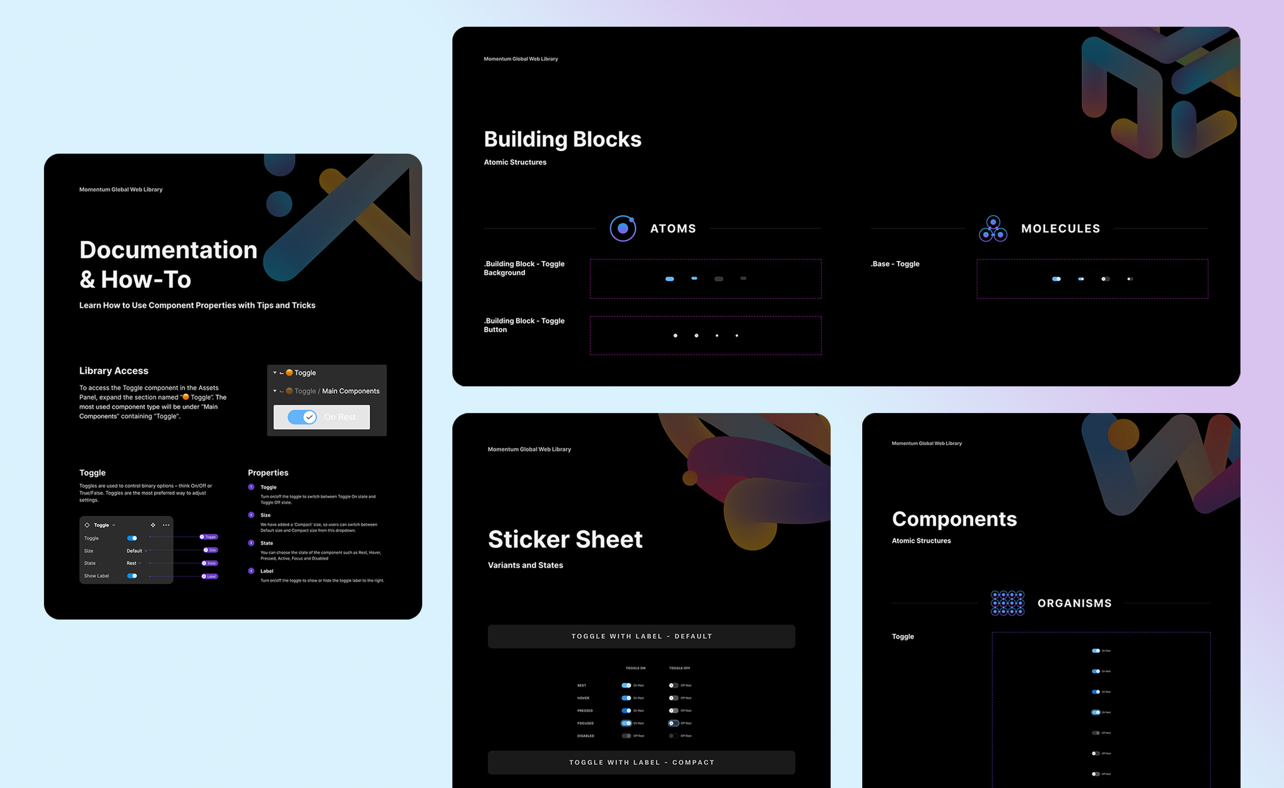
DocumentationTo eliminate inconsistencies and ensure that users can properly utilize the components, it was essential to provide thorough and detailed documentation, accompanied by clear how-to guides and usage instructions.
The two primary design systems in use were the Admin Design System and the Legacy Momentum Design System. Since the Admin Design System was specifically created for the Control Hub, we decided to prioritize the Legacy Momentum Design System and integrate any missing elements from the Admin Design System.
Competitive analysisWe conducted a competitive analysis by researching Google Material, IBM Carbon, and Shopify Polaris. Our focus was on the types of components each system offers and the depth of documentation provided for each component.
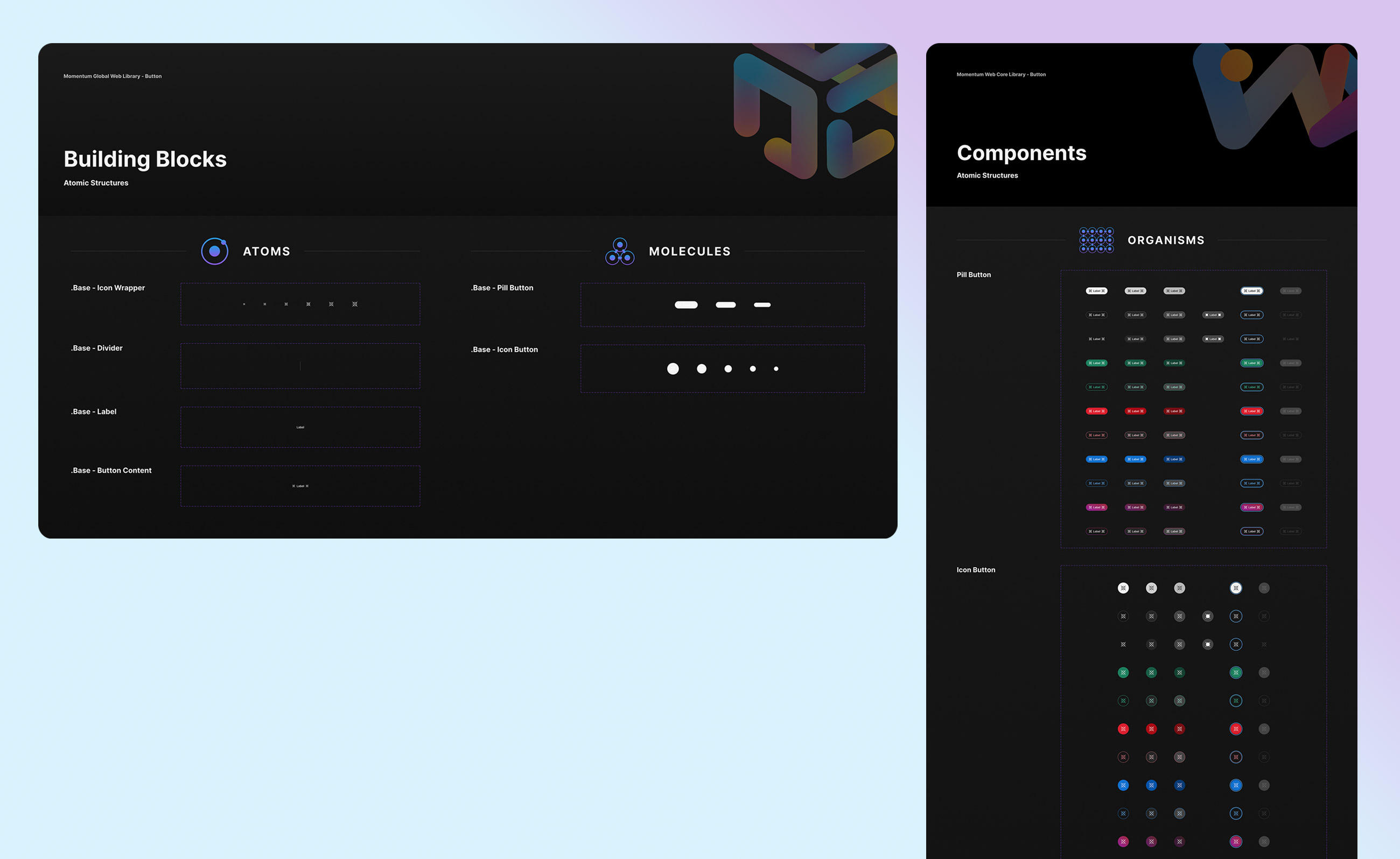
Atomic systemAs we developed a new Figma design system file from scratch, we adopted the Atomic Design methodology for the rebrand. This approach enhances consistency, capability, and reusability while fostering improved collaboration among designers.
Dark modeFor the rebrand, we prioritized Dark Mode, which was absent in the current system. Research shows that about 70% of software engineers prefer Dark Mode, and user feedback indicated a strong demand for it. Additionally, Dark Mode helps save battery life, reduces blue light, and lessens eye strain.
AccessibilityThe legacy system lacked thorough accessibility checks. By collaborating with A11y specialists from Applause, we established a mandatory process ensuring that no component is approved without a review with Applause designers.
As a team we have audited total of 39 components, deprecated 4 components, added 5 new components
From the 39 components audited, 34 of the components got rebranded and documented.
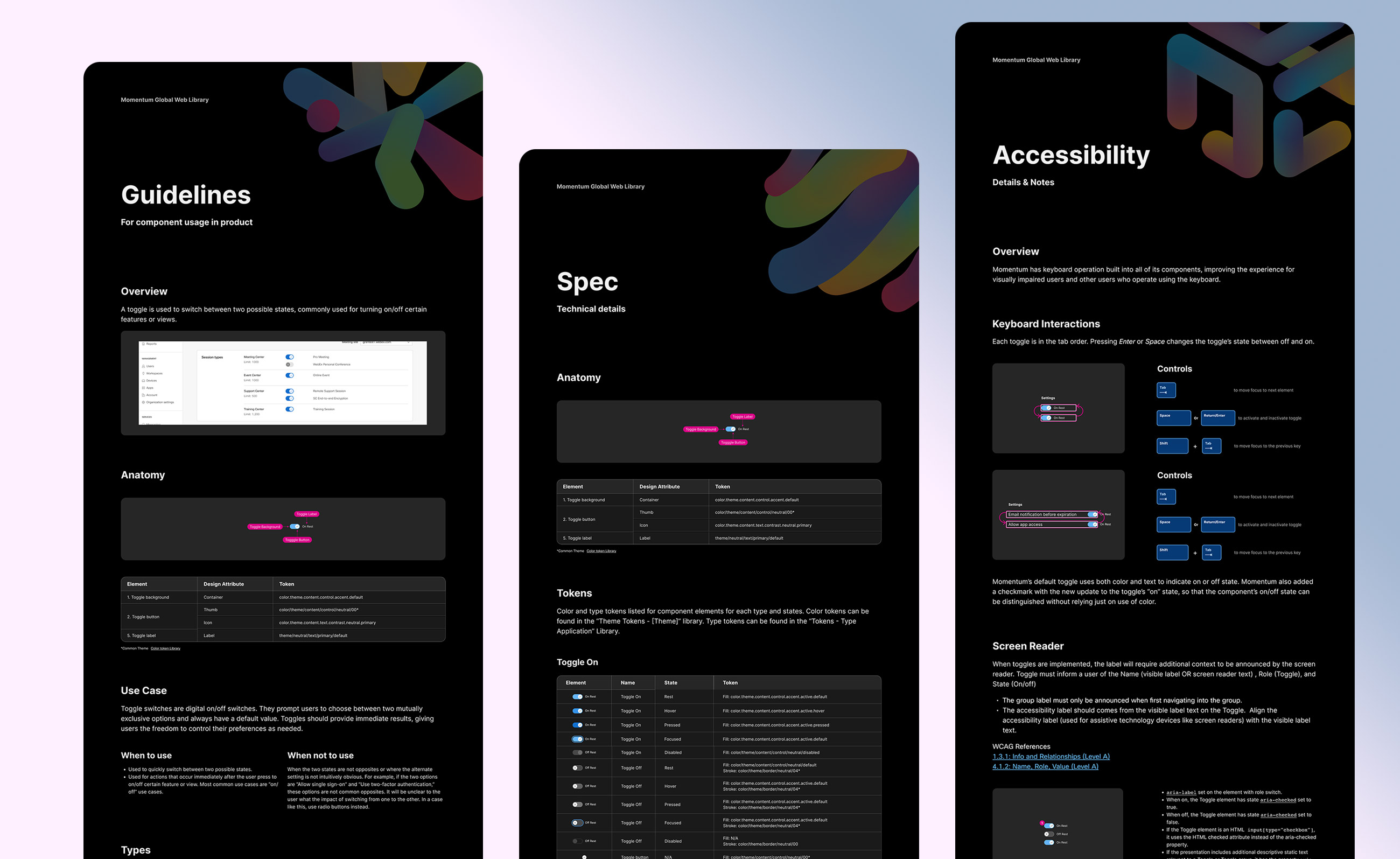
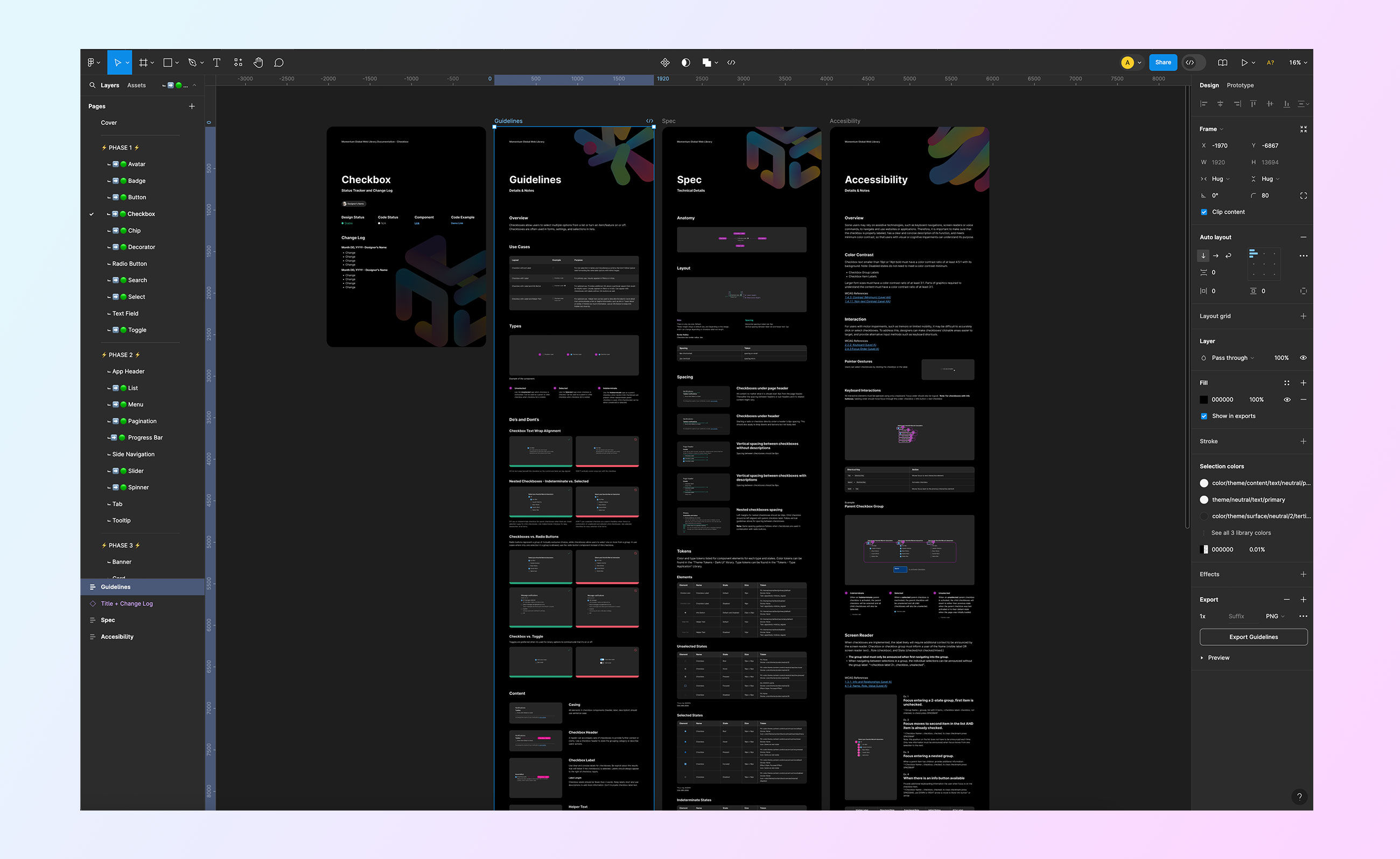
During the rebrand process, we have also create Component Documentation template, and Guidelines that sets rules for Content order, Spacing, Component example padding, responsiveness design and new Type system.
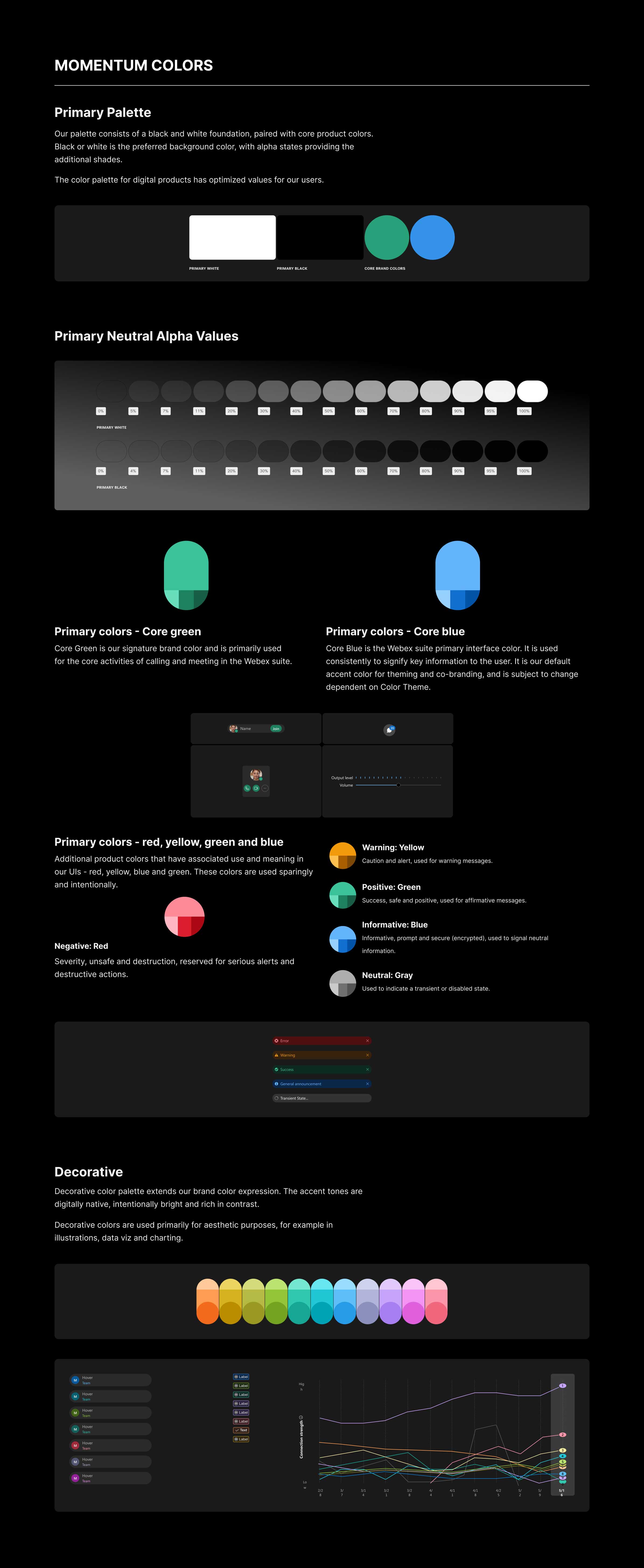
The renewed palette features a black and white foundation, complemented by core product colors. Black or white serves as the preferred background color, with alpha states adding depth through various shades.
Each color includes lighter and darker shade tokens, designed for specific backgrounds to meet accessibility standards. The neutral palette encompasses a range of white, black, and gray tones.
The decorative color palette enhances the brand's visual expression with digitally native, bright, and high-contrast accent tones, primarily used for aesthetic elements such as illustrations, data visualizations, and charting.
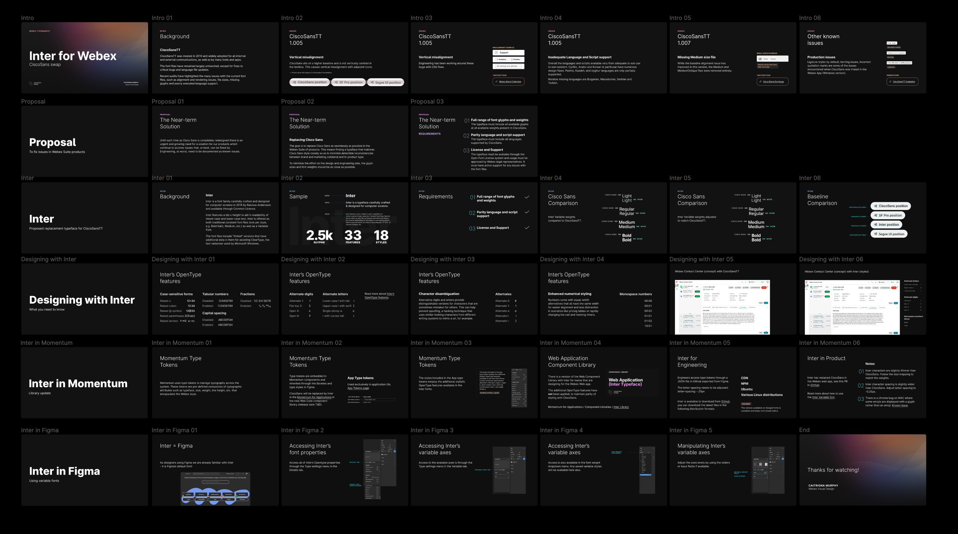
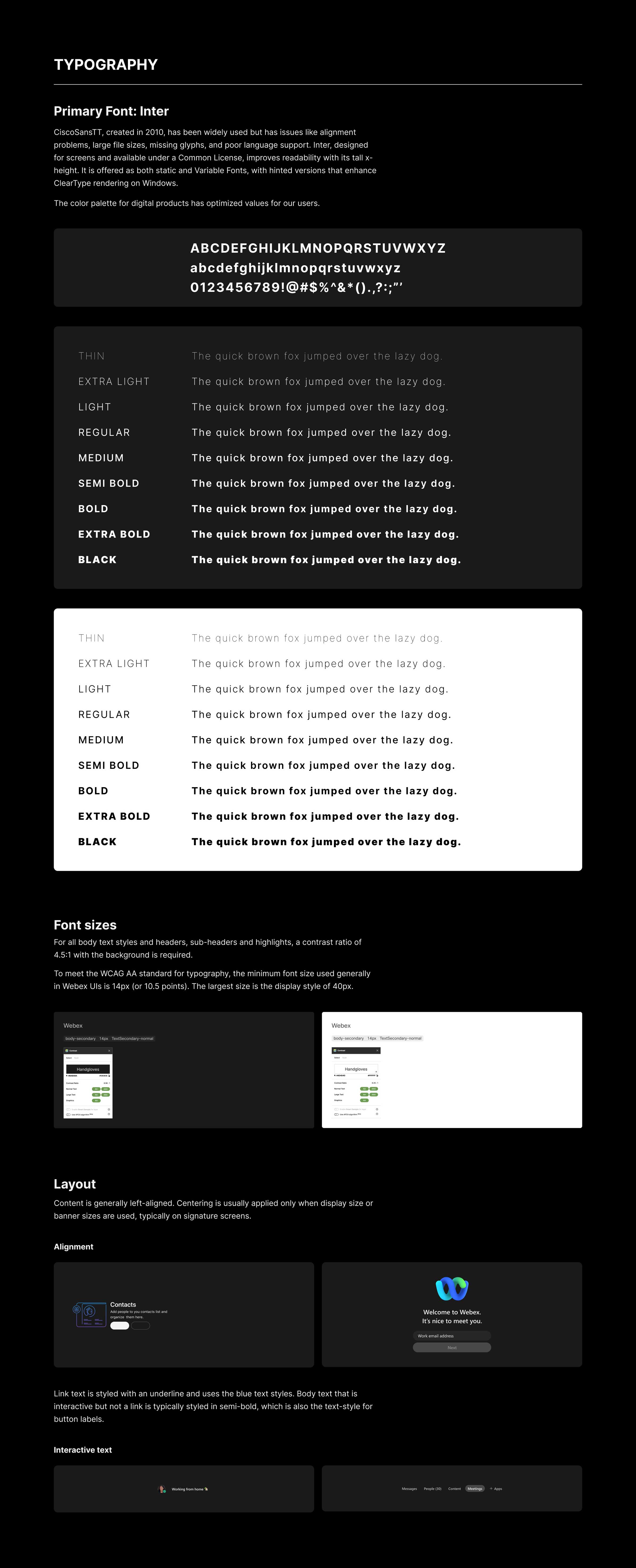
CiscoSansTT, created in 2010, has been widely used but has issues like alignment problems, large file sizes, missing glyphs, and poor language support. Inter, designed for screens and available under a Common License, improves readability with its tall x-height. It is offered as both static and Variable Fonts, with hinted versions that enhance ClearType rendering on Windows.
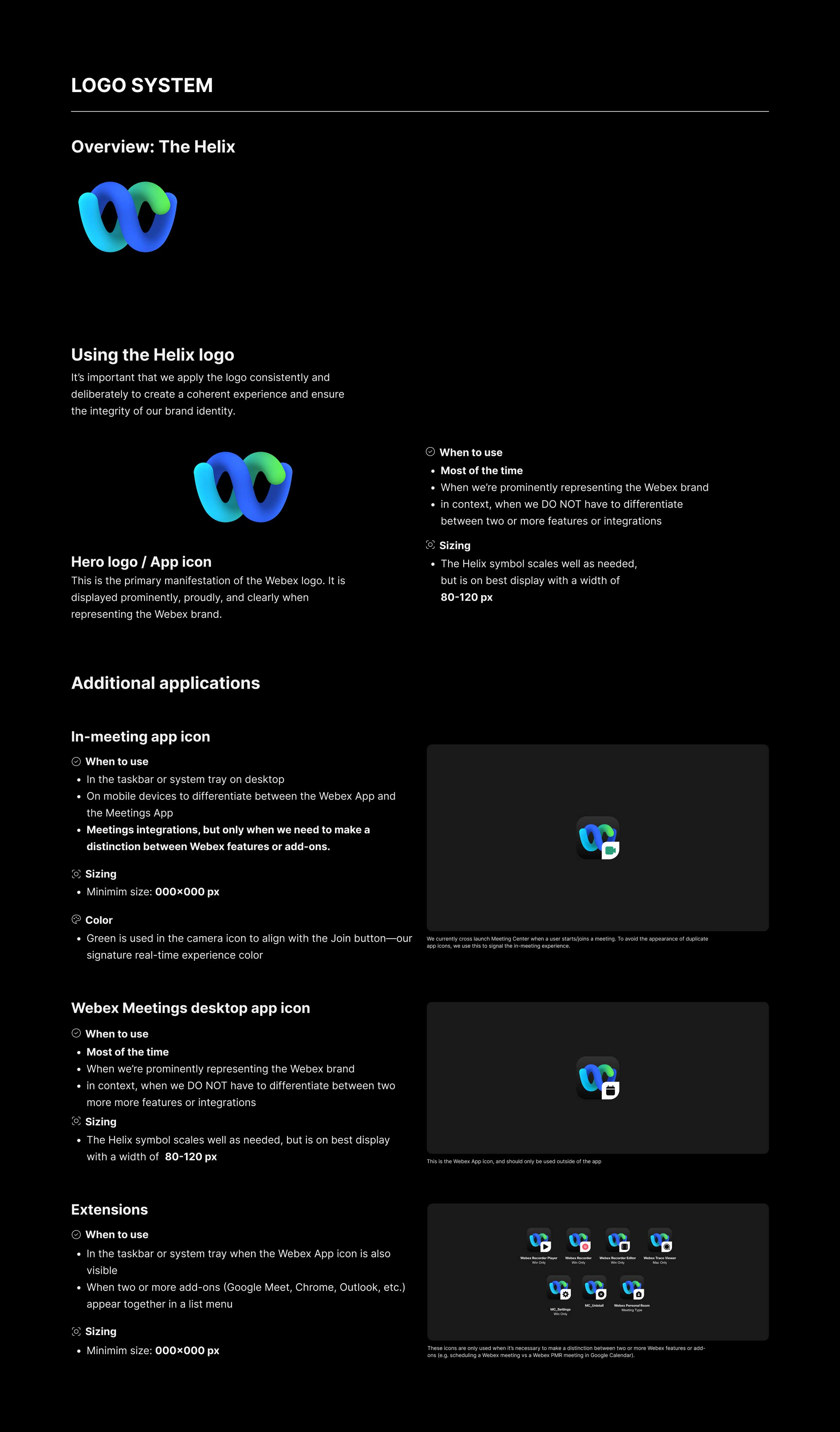
The Webex Helix logo is used to build equity and recognition for the Webex brand, our symbol is distinct and modern to convey our forward-thinking nature. It is both a “W” for Webex and a helix, comprised of two rounded, equal forms that come together, representing the harmonious flow of ideas that happens when we collaborate with each other.
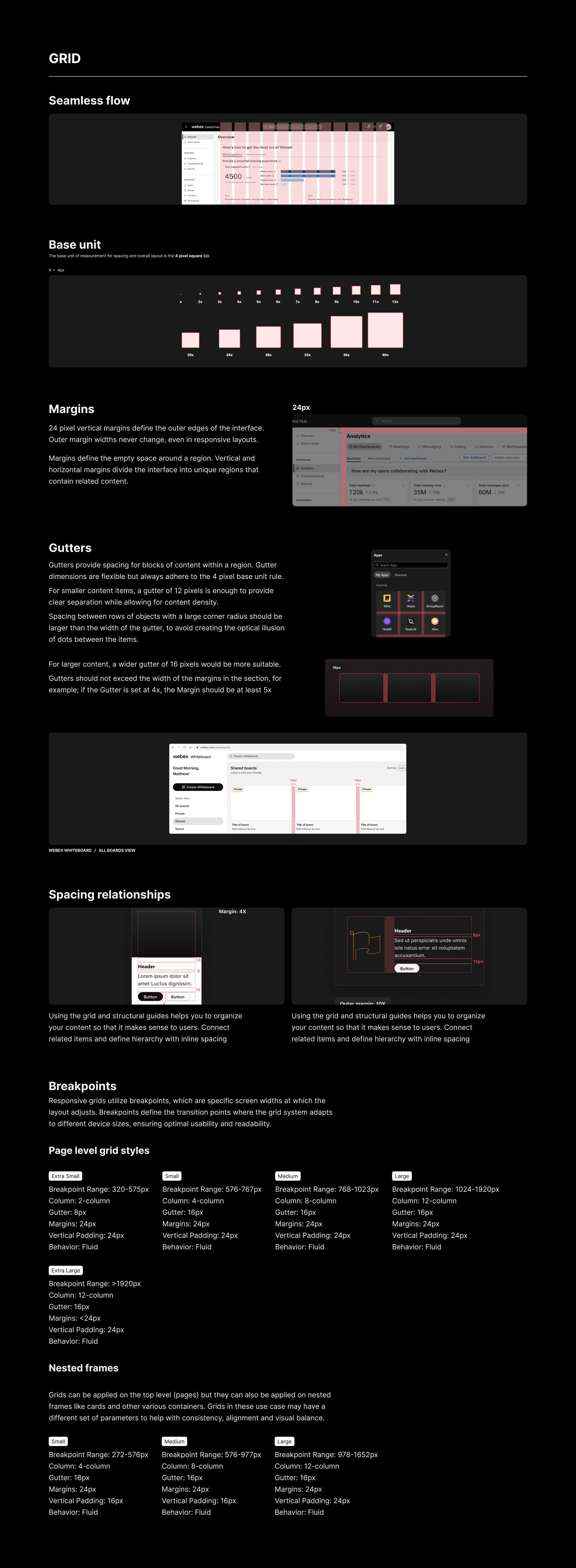
TThe underlying grid provides a robust foundation to build cohesive layouts. Using structured layouts creates a strong visual balance to complement our rounded UI system. The UI grid, columns, gutters, and spacing scale from the fundamental base unit. Adequate white space reduces the reliance on containers to group content, decreasing clutter and noise. Rhythm and balance are achieved through repeating alignment patterns.
Design Systems are always evolving to support all Webex products, designers and engineers. We frequently receive requests for updates, new components, and reviews. What I've shown is just a small part of a full design system. A complete system includes:
DocumentationFull details on how to use, implement in figma, use cases and specs.
GuidelinesIncludes layout, tone & voice, content style, color tokens, type tokens and more.
TrainingWe have also created training on how the components were built, implementing on figma, updating, file hygiene and product use cases.
Documentation WebsiteWe are also putting all the documentation information on the Momentum Design System website, so designers can have easier access to the documentation.
I’m looking to join a cross-functional team that prioritizes improving user experience through accessible and innovative design. Got a project in mind? I’d love to connect!