< Andy Kim Web Design

WORKS

Momentum Design Website

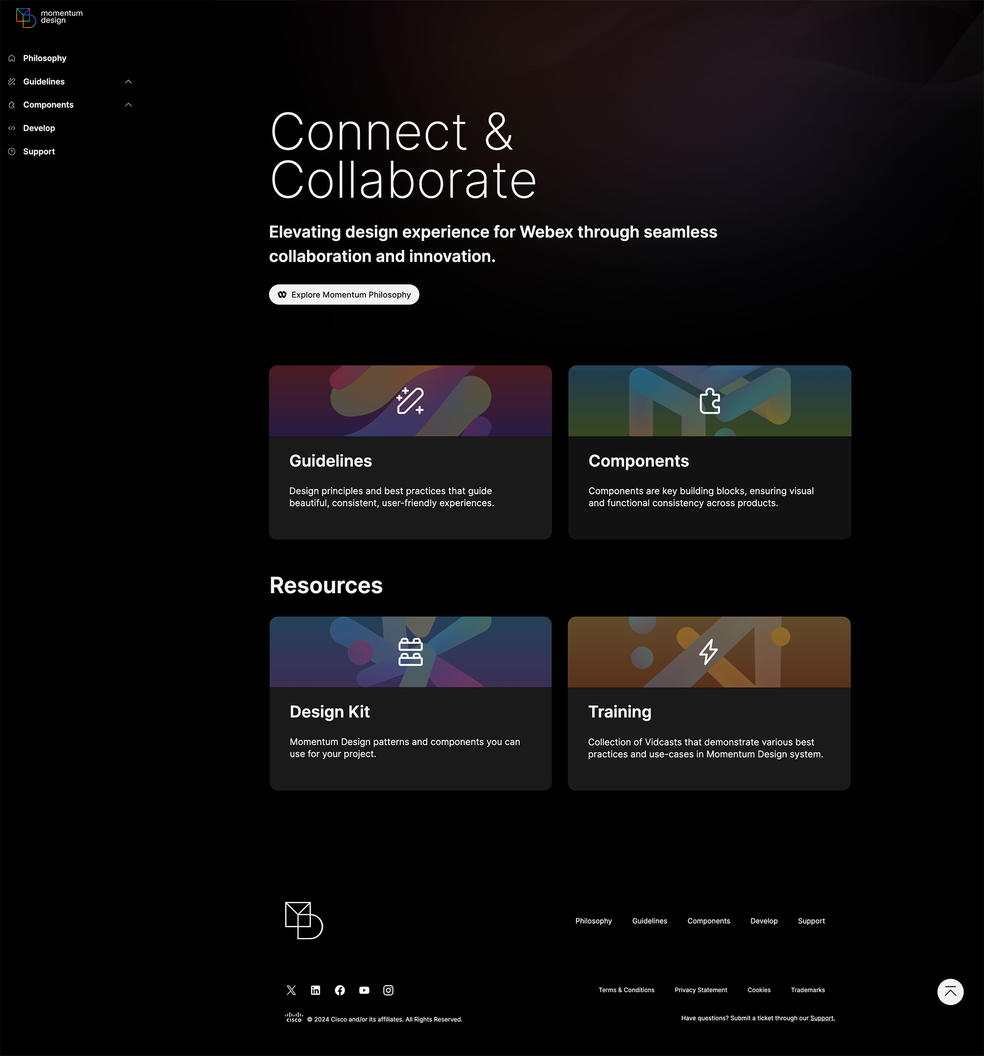
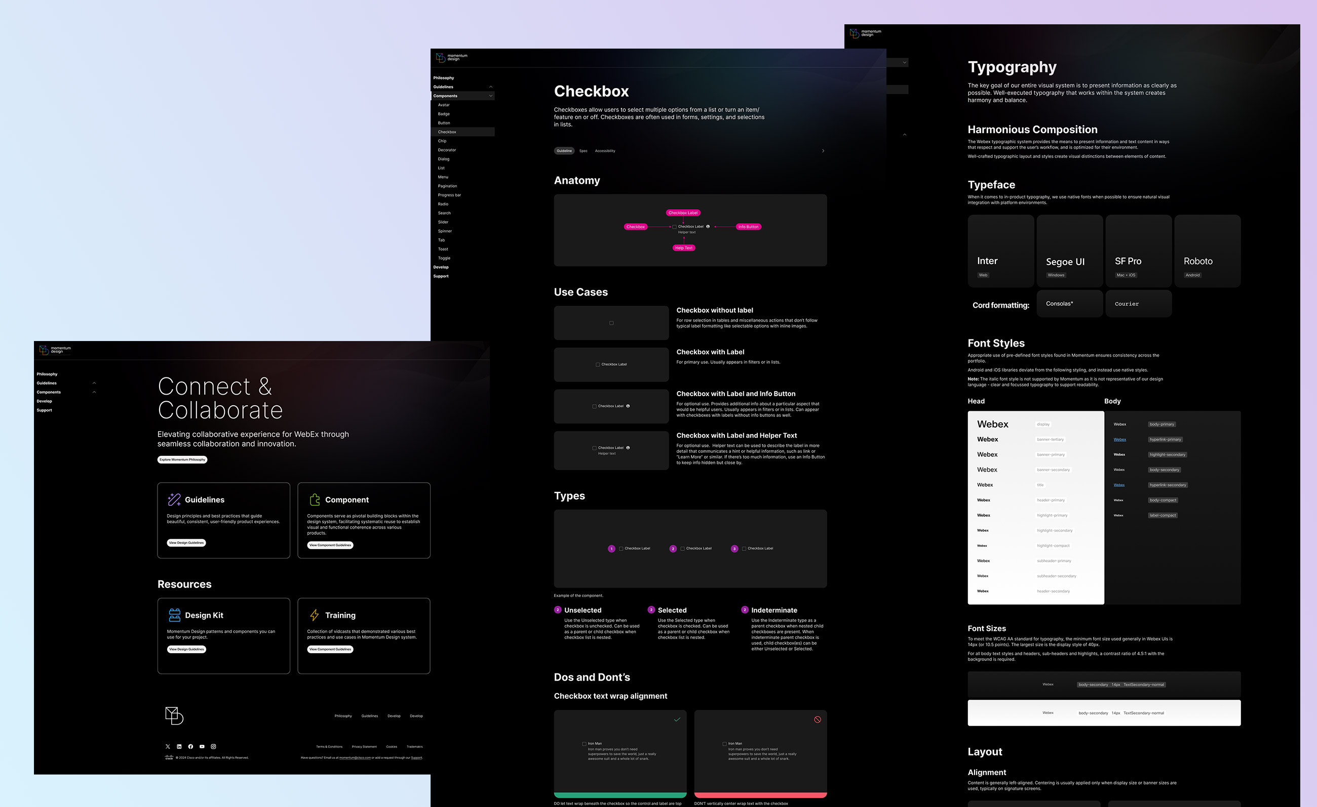
Momentum.design is a website that showcases the Momentum Design System, providing all documentation, use cases, how-tos, and training for the component library used in Figma.

This public-facing website is designed for internal Webex designers, engineers, stakeholders, and other non-Webex designers interested in the Momentum Design System.

Created at

Momentum Design/Engineer Team

Role

Head Designer, Research, Stragety

Client

Momentum Designers and Engineers

Stakeholders

Other designers in Momentum Design system team, Director of Design, Director of Collaboration
Problem

The Momentum Design System website has been outdated for quite some time, and an update was long overdue. The team aims to improve and modernize the documentation website for all users. Due to the outdated information on the current site, designers were often provided with obsolete guidelines, leading to the implementation of old design practices without the design team's awareness. These issues were only discovered after the launch. With the comprehensive rebrand of the design system components, the new website will be dedicated to accurate and up-to-date system documentation.

Goal

This will be the single source of truth for all designers, engineers, and other stakeholders interested in learning more about Momentum and its application in products.

Designers on the Momentum team must be able to update and maintain information on the site without the help of engineers. We want to eliminate as many roadblocks as possible to updating website content.
Planning

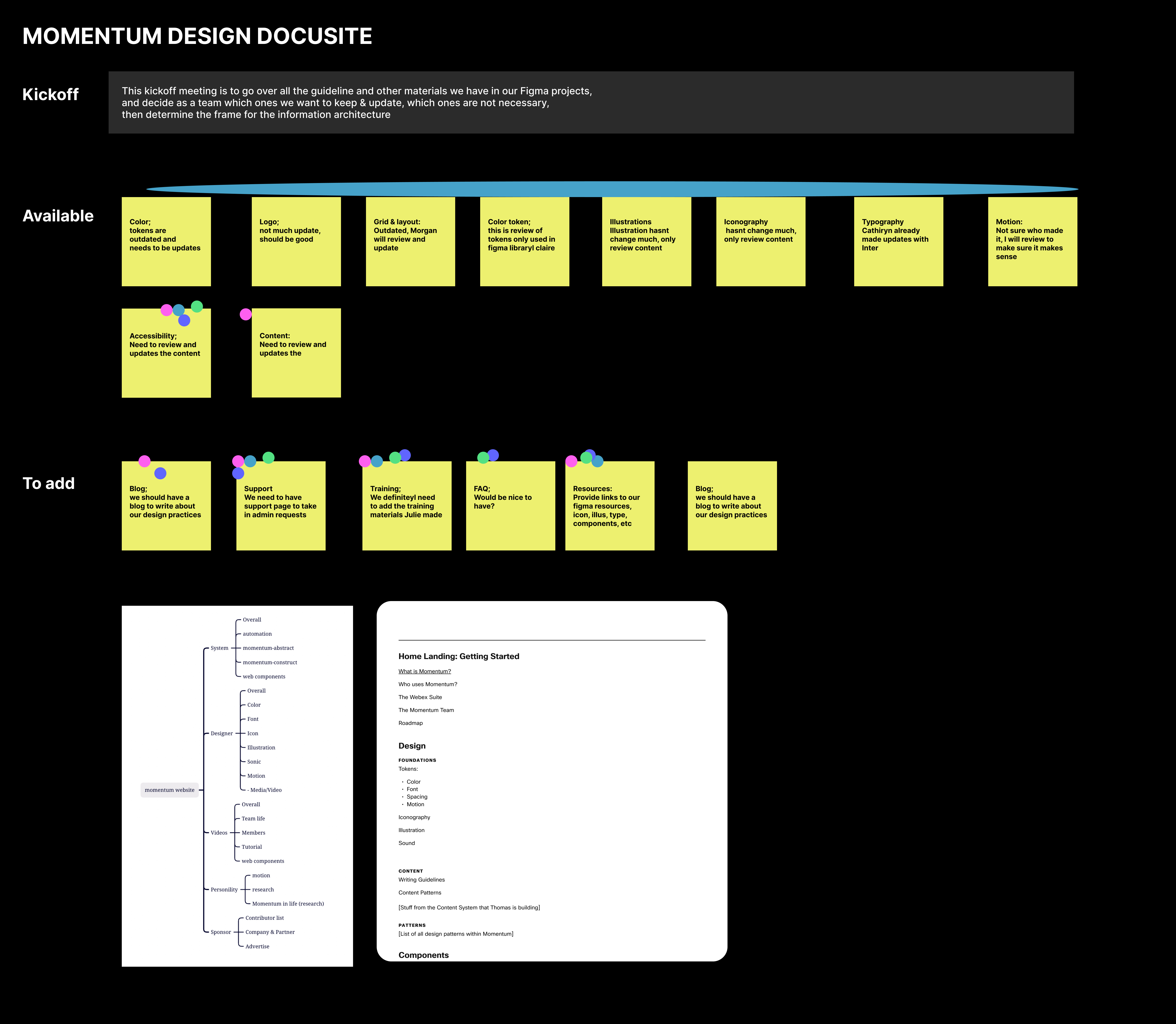
As the sole designer working on the project, I began with a kickoff meeting involving all designers who contributed to the current website and its content.

From the meeting, we decided what to keep and what to discard, gathered content materials, organized the content into different categories, created an information architecture, and established a timeline.

Research & Strategy

What we have

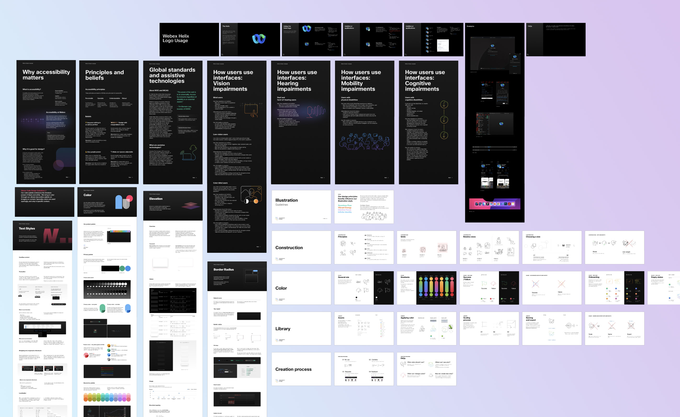
Everyone agreed to divide the site into two broad categories: component documentation and guidelines. As the entire team was rebranding the component documentation, we already had guidelines on Momentum elements such as grid & layout, logo, color, illustration, iconography, typography, motion, and accessibility.

What we need

The guidelines, like the website, were outdated. Identifying the creators of each guideline and updating them was essential to keep the information current. We also agreed that we could not wait for the entire team to finish rebranding all component documentation before updating the website. Therefore, we divided the components into sprints to plan the documentation completion.

What others have

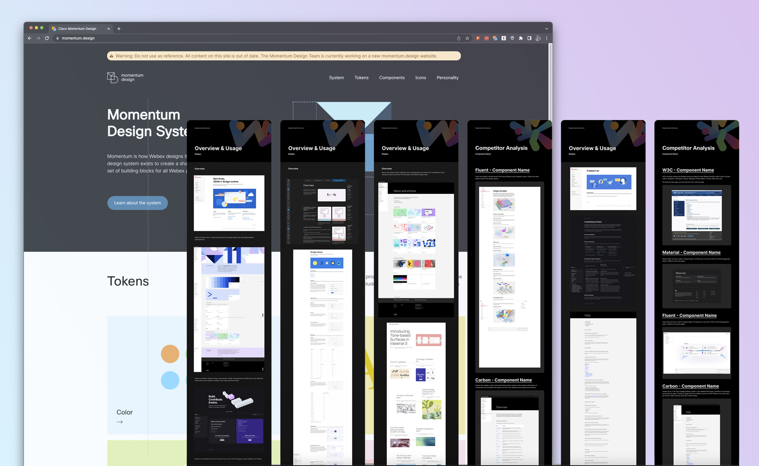
While Momentum Design is for Webex, we didn't need to reinvent the wheel. We referenced well-established design systems such as Google Material, IBM Carbon, Shopify Polaris, and Apple Design to understand what we needed to compete with these systems and what additional features we could provide.

What our users need

Our primary users are Momentum designers working on Webex, Control Hub, Partner Hub, Webex Analytics Platform, and Webex engineers implementing the designs. Both designers and engineers need access to color tokens, spacing tokens, and typeface tokens to ensure consistency across all products.

Communication

Communication for this project was straightforward since the main stakeholders were designers from the same Momentum Design Systems team. I provided updates during twice-weekly stand-ups to ensure everything stayed on track. I also scheduled milestone check-ins with the Director of Design and Director of Communication to keep them informed. Since the Director of Design contributed a significant amount of content for the website, we held three additional meetings to review the pages and ensure the content and visuals aligned properly.

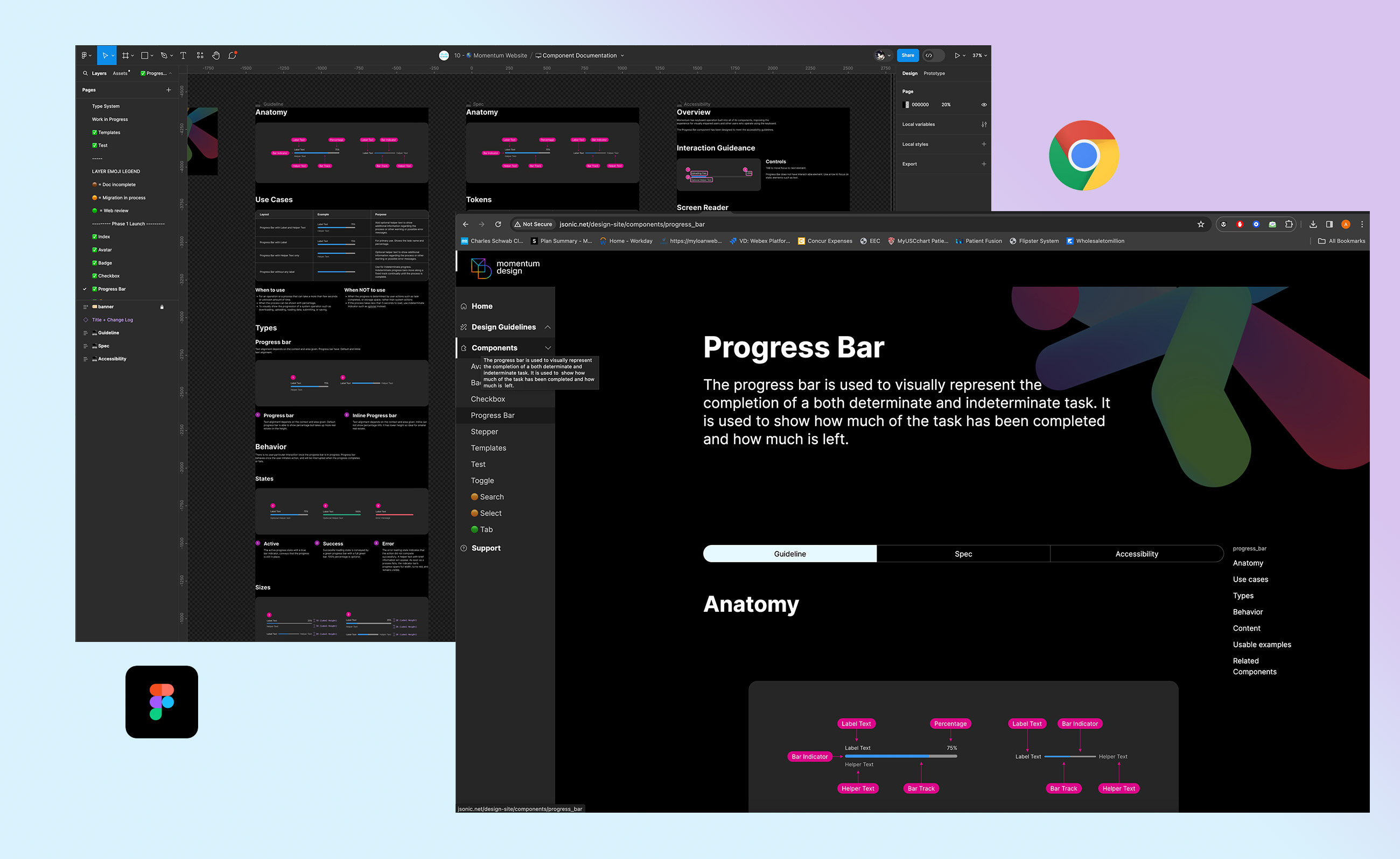
Current website and competitive analysis on Material, Carbon, Fluent, Polaris and other
Different type of guideline contents that needed to be organized

Information Architecture

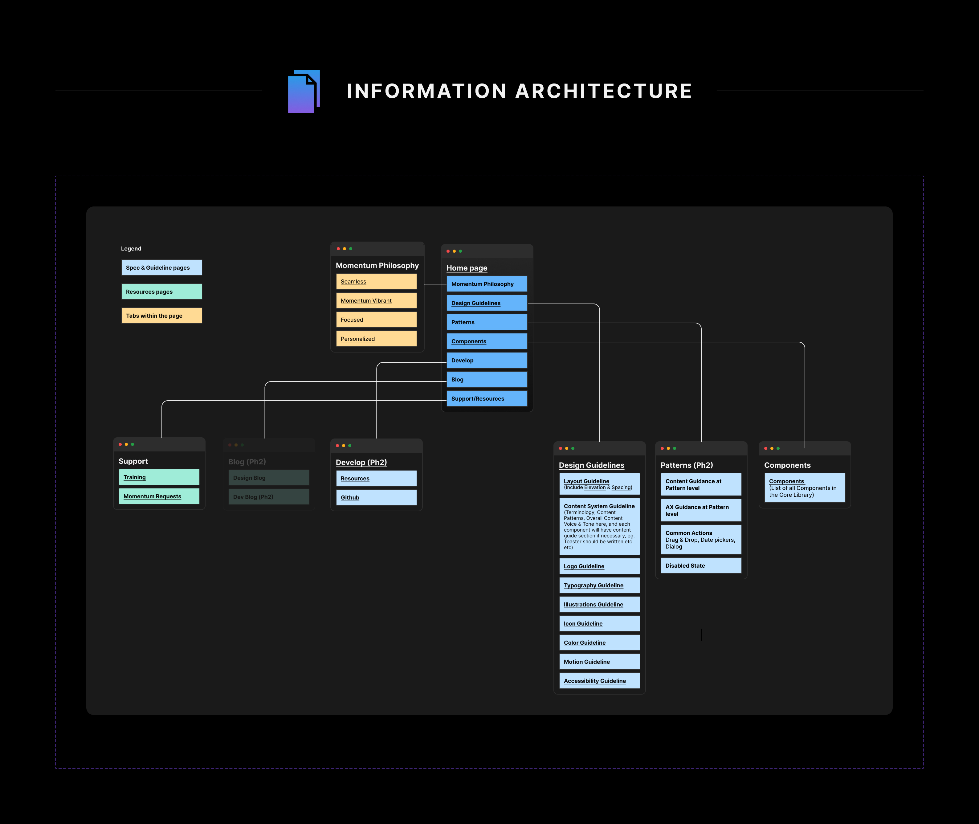
Once we determined the website's content, I started creating the information architecture. Initially, it seemed simple to have two main sections: Guidelines and Components. However, our competitive analysis revealed the need to promote our design brand and philosophy, and provide support, training, and blogs.

Each guideline and the overall design needed to be logical for users. While some pages might not be highly visited, it was important for the Momentum team to define our seamless, vibrant, and customized design thinking behind each guideline and pattern.

Design

Reinventing the wheel is often unnecessary. As we were already working on the Momentum Design System rebrand, it made sense to stay within the theme of the rebrand documentation design.

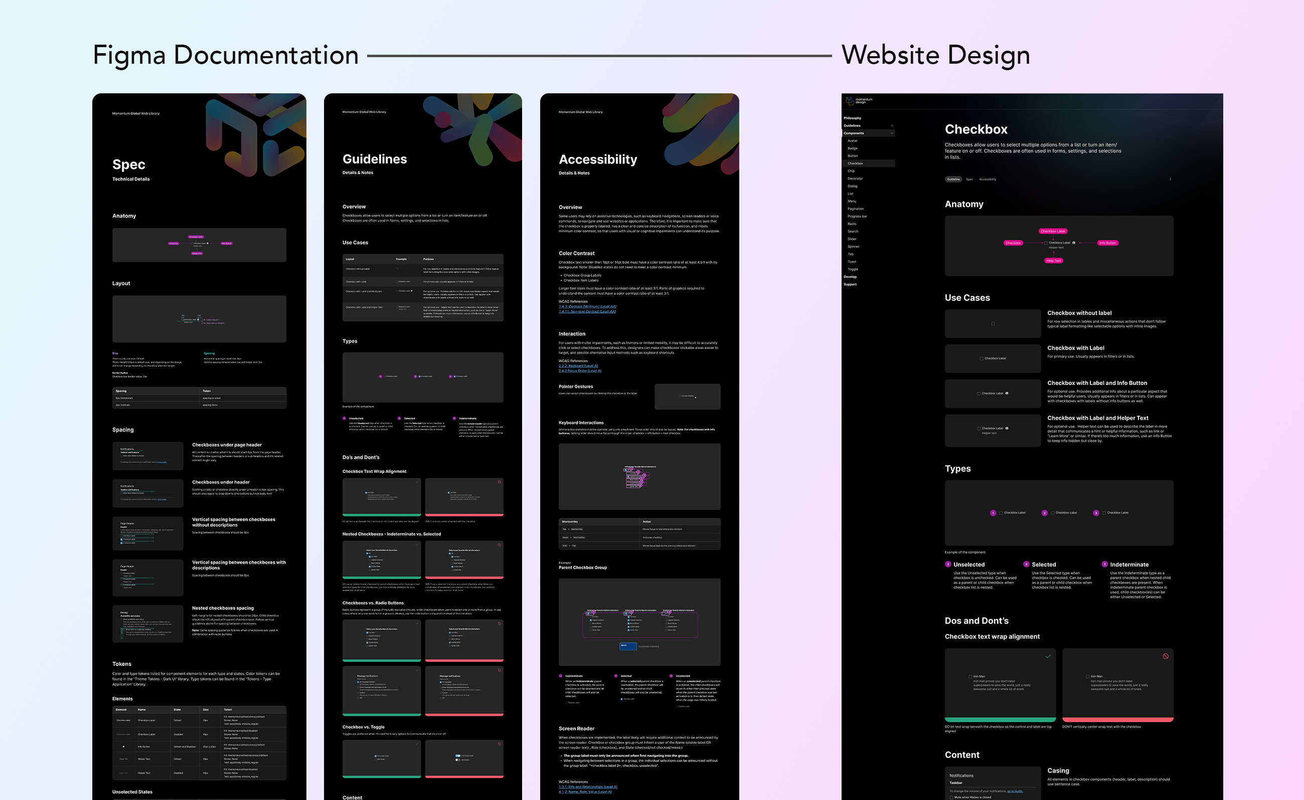
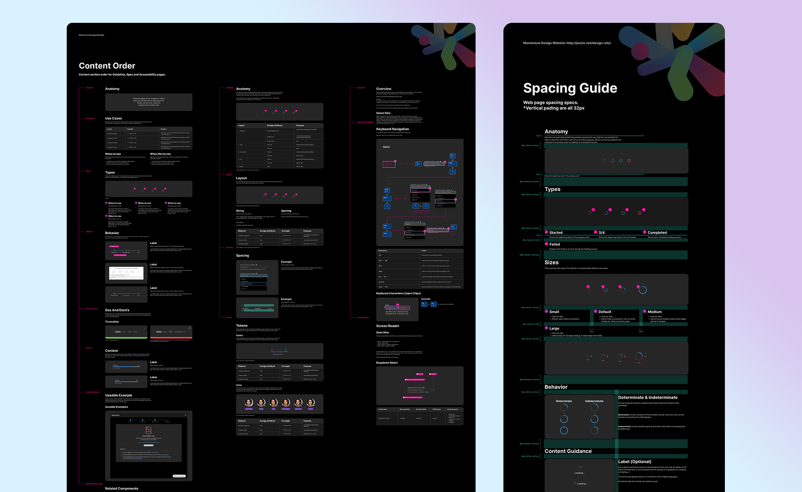
With dark mode as the default, we focused on spacing, typeface, sizing, and grid. Since the Momentum Design System documentation Figma template was not designed with a website in mind, I created a new template for the website.

Once the template was created and QAed, I began the content migration. The challenge was that guidelines were created at different times with different design templates, resulting in varied color tokens, typefaces, spacing, and font sizes. Migrating this content into the new template was time-consuming, but having a template made the process smoother.

Engineering

As mentioned in the goal section, a critical objective was to enable designers to update and edit website content post-launch without relying on engineers.

Fortunately, the engineer on this project devised a way to translate Figma designs onto the web. Through Git, designers could submit work orders for the backend to grab the design, recognize each element by its layer name, and render them appropriately.

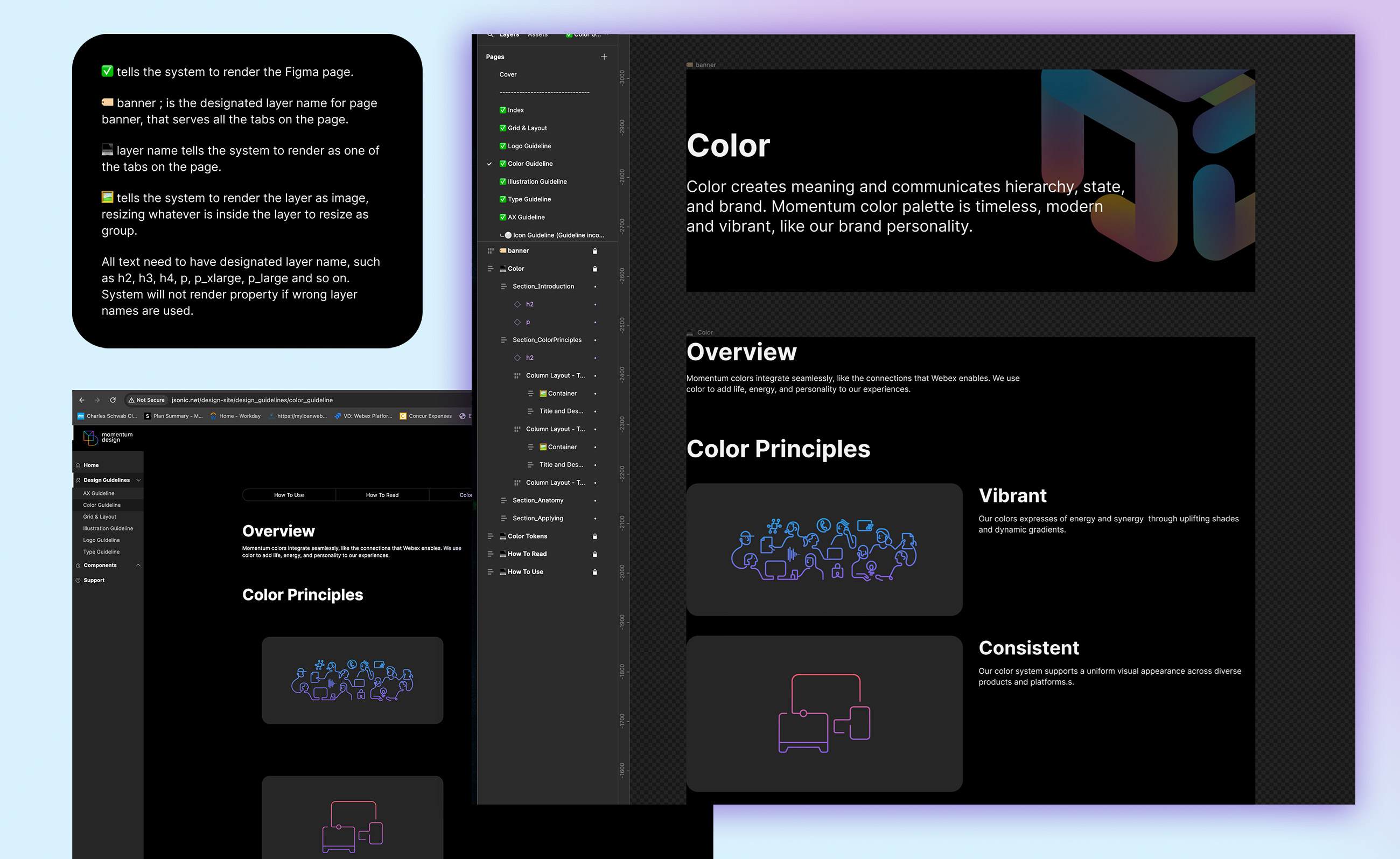
By working with the engineer and using specific emojis on layer names along with appropriate auto-layout properties, the website could recognize type hierarchy, images, pages, tabs, and ensure responsiveness.

Set of layer naming rules to communicate Figma with back-end to render properly
New guidelines on Content Order, Spacing and responsiveness

QA

Getting the Figma-to-web rendering right was not a quick process. We went through multiple trials and errors, experimenting with different auto-layout and image settings. Once the settings were correct, I trained other designers to use the template and QAed the pages to ensure consistent content.

Next Steps

The engineers are working on creating a Figma plugin to make the rendering process easier and more convenient. Currently, designers need to manually trigger the GitHub pull one at a time.


Contact Me

I’m looking to join a cross-functional team that prioritizes improving user experience through accessible and innovative design. Got a project in mind? I’d love to connect!