WORKS

First Time Set-up Wizard

FTSW, or First Time Set-up Wizard, is an onboarding process designed for both new and existing partners to help them sign up for either a paid or free trial service. This process guides users through setting up essential features, including meeting, calling, and device functionalities.

Created at

Admin Design Team

Role

Visual Design, User Experience, Strategy

Problem

The first-time user experience inherited from the BroadSoft acquisition in the Control Hub was outdated and inefficient. Significant issues included visual errors, unclear navigation, and a lack of consistency in visual design. These problems particularly impacted the processes of trial creation, trial setup, and trial-to-paid conversion.

Goal

The goal is to redesign the UX by analyzing and updating current process with the latest visual design elements from the Admin design system. This effort aims to specifically enhance the trial creation, setup, and trial to paid conversion processes, ensuring a more seamless and intuitive experience for the partners.

Planning

Since we already had an existing platform, we began by auditing and analyzing the current process to identify its flaws. We also planned user interviews and conducted research to pinpoint the actual pain points experienced by users. With guidance on executive expectations from the project manager, we collaborated closely to fully rebrand and refine both the design and UX process.

From the meeting, we decided what to keep and what to discard, gathered content materials, organized the content into different categories, created an information architecture, and established a timeline.

Research & Strategy

Audit

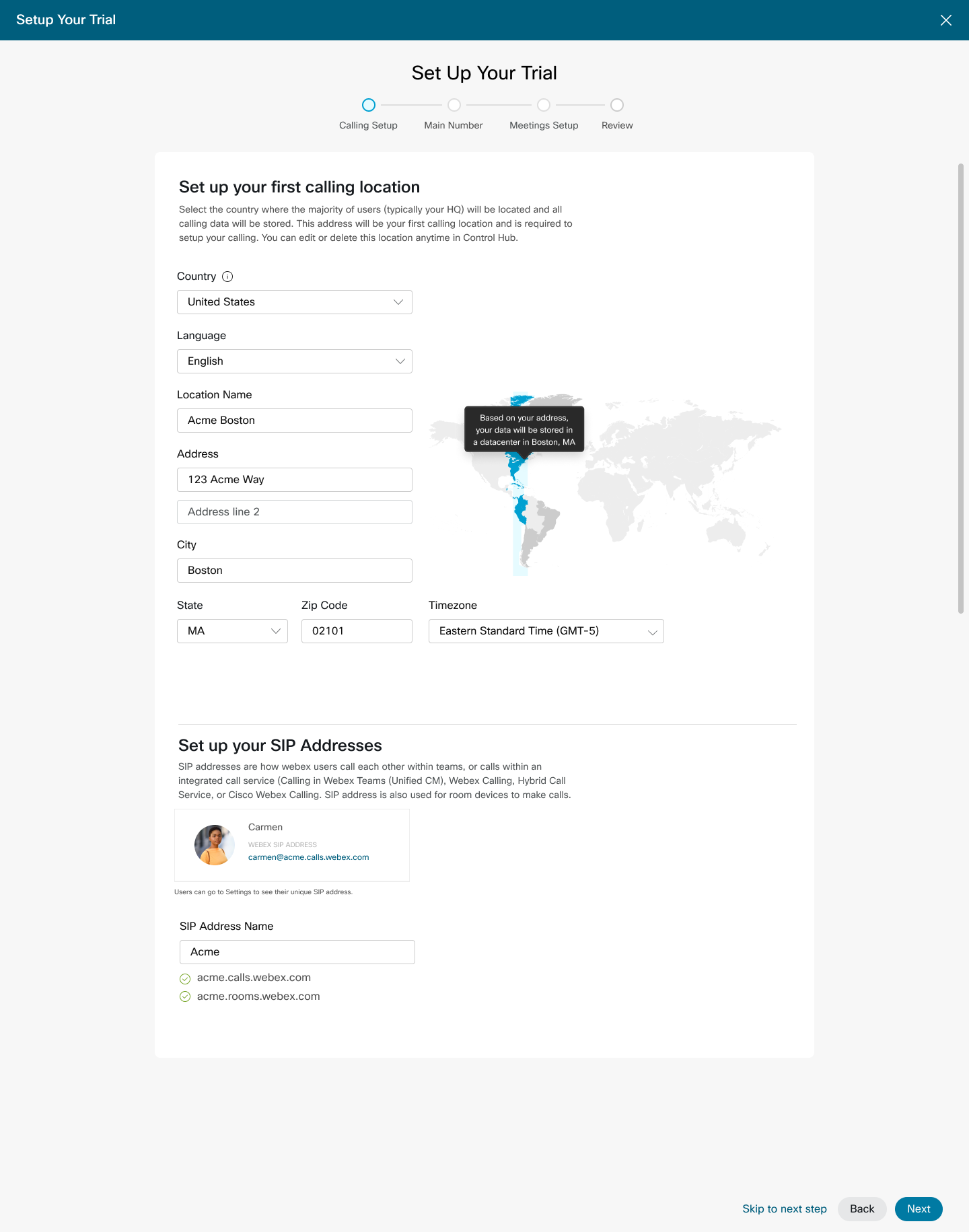
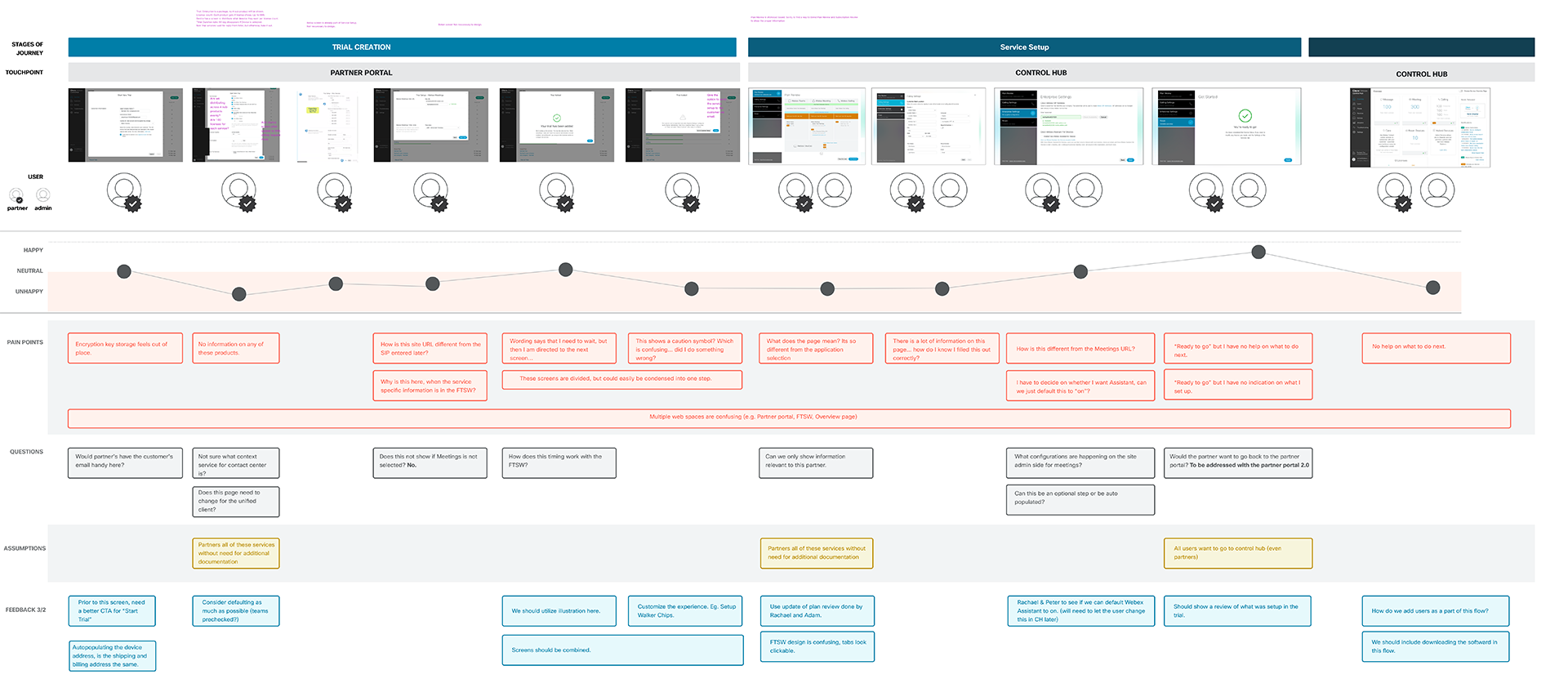
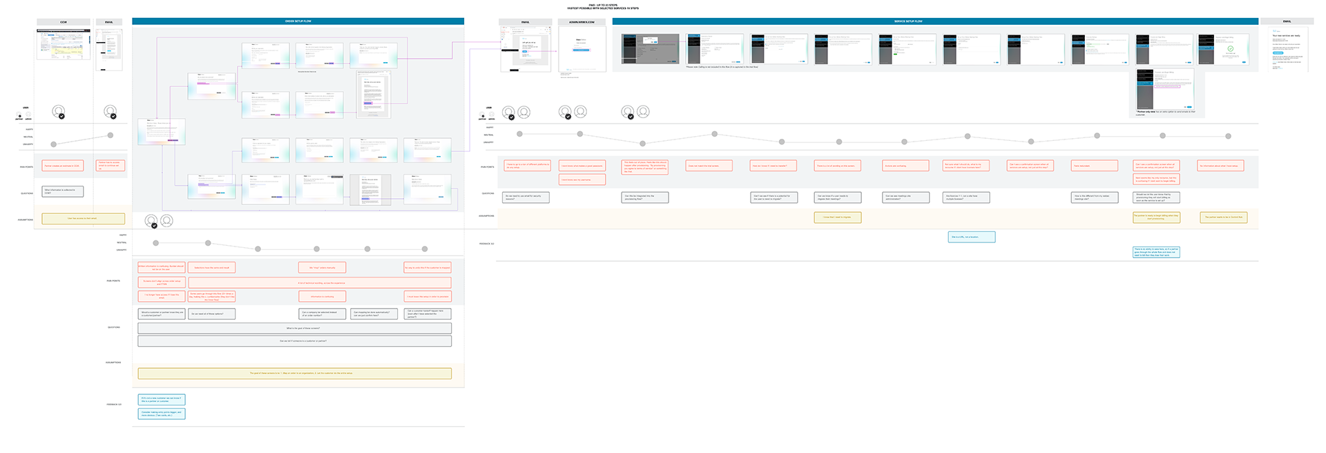
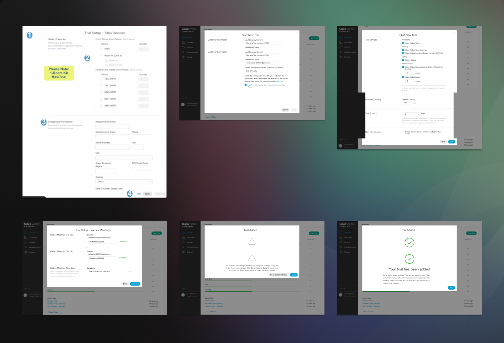
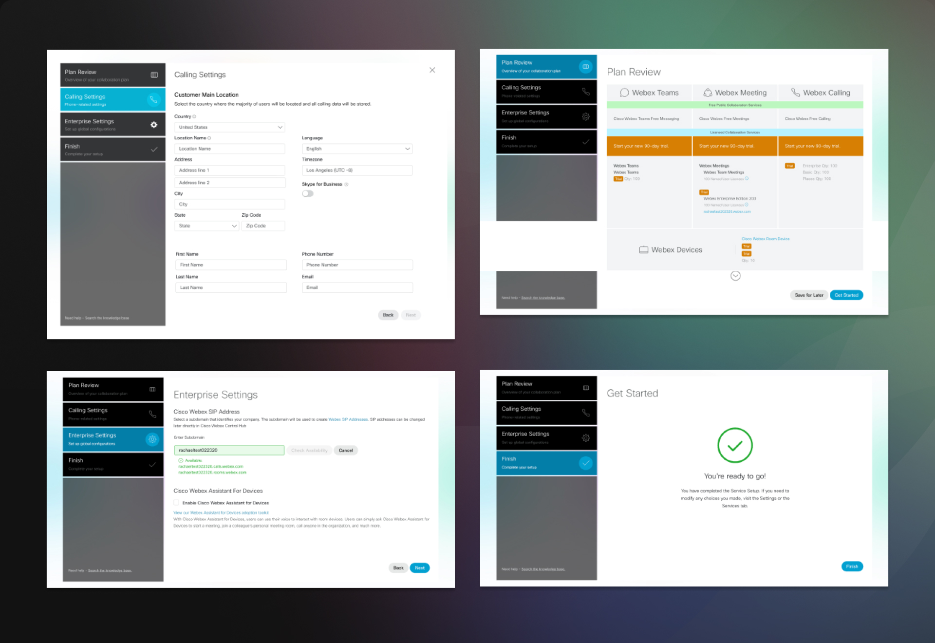
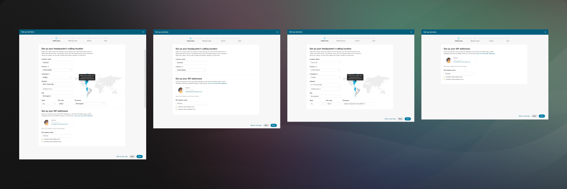
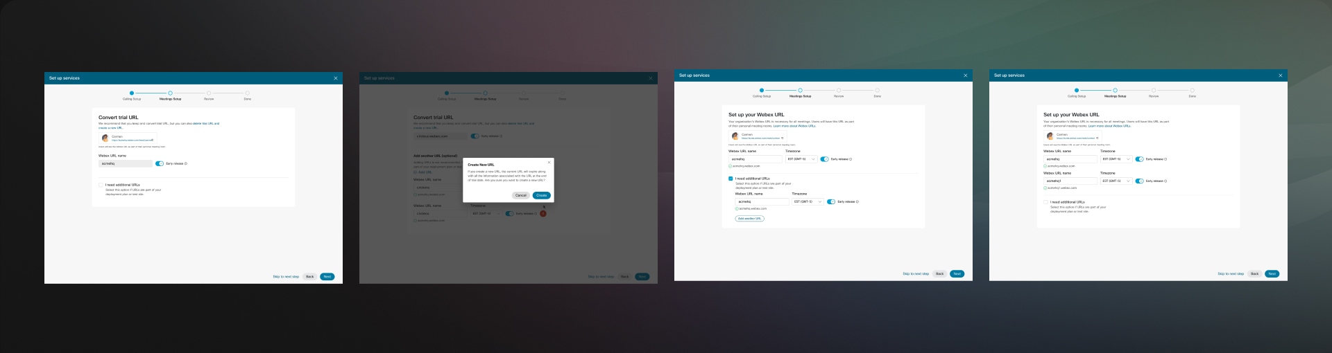
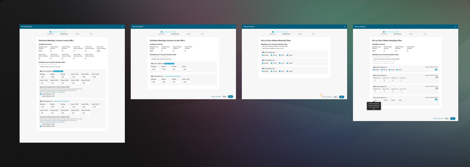
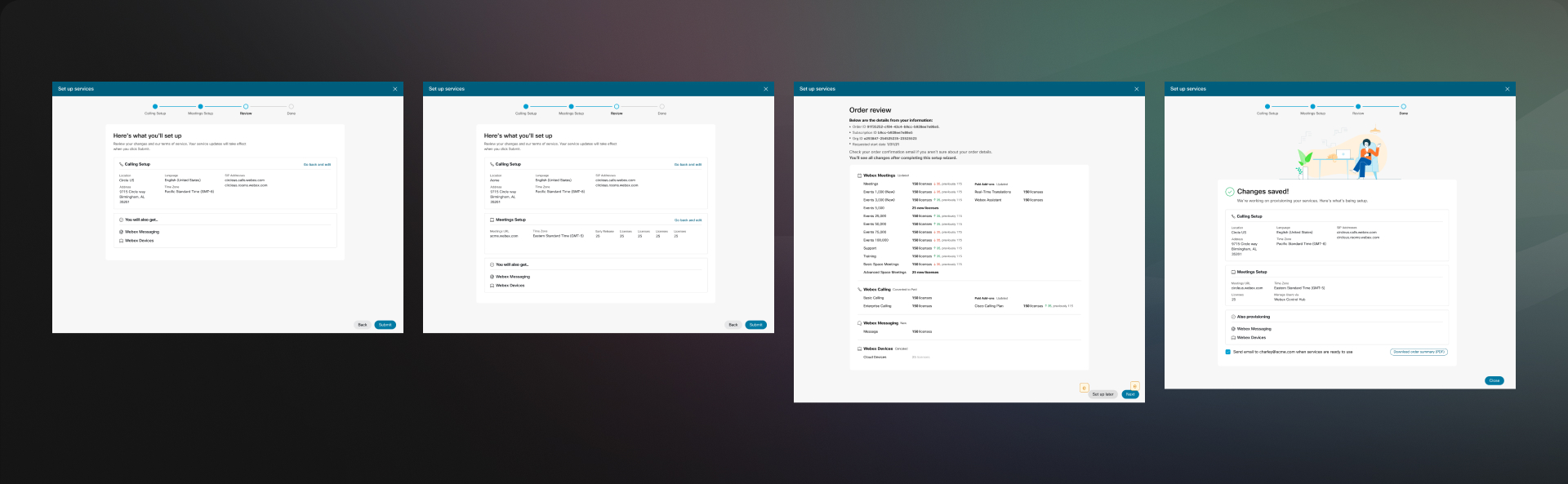
We meticulously reviewed each screen of the current process to identify pain points, formulate questions for the Product Team, and track feedback. Our findings revealed several issues, including duplicate input fields, misplaced inputs, improper label placement, lack of product information, inconsistent component sizes, and unclear instructions.

What we need

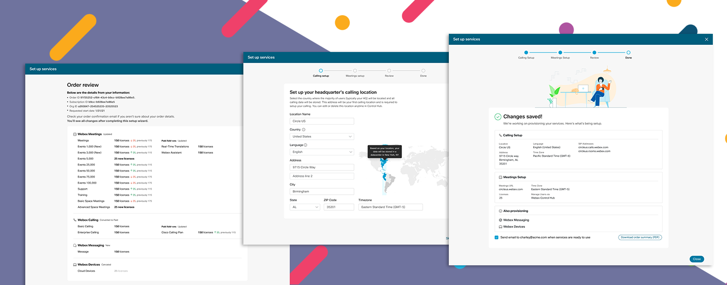
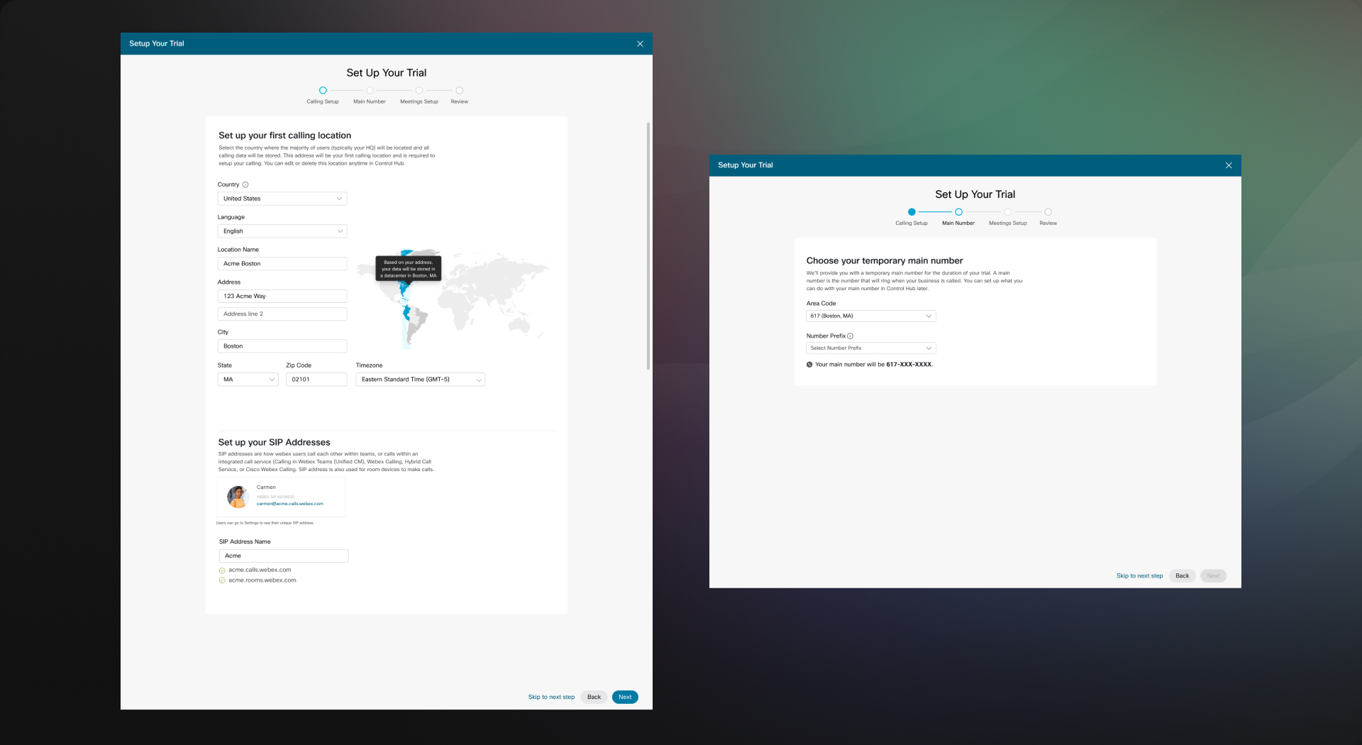
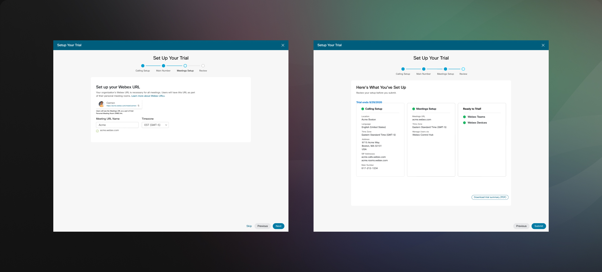
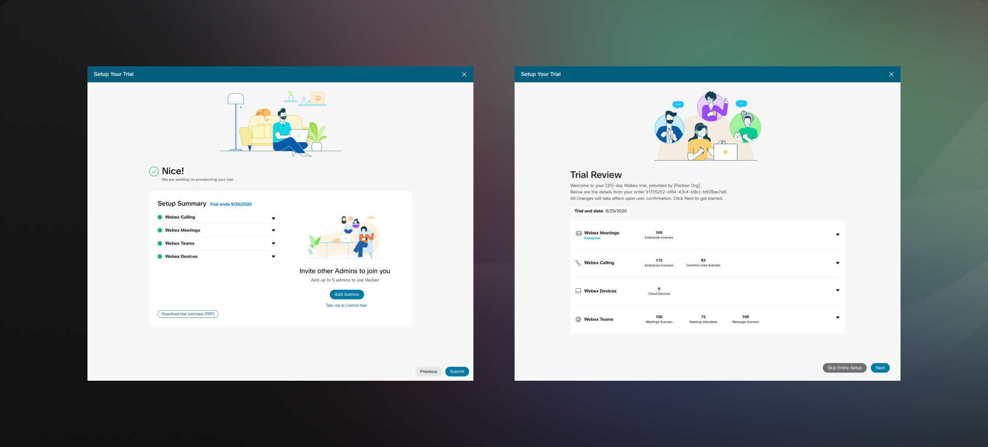
We focused on achieving consistent visual design and proper placement of inputs. We ensured clear division of instructions for user information, location settings, and device settings. Additionally, we developed distinct processes that adapt based on user choices.

What others have

We reviewed sign-up processes from RingCentral, Vodafone, and Google Pixel. While Google Pixel's process stood out as simpler, we found that the sign-up experiences from RingCentral and Vodafone were also complex. Despite this, we focused on enhancing our own offerings, taking note of how RingCentral and Vodafone structure their sign-up processes to inform our improvements.

What our users need

Our users need a simple and easy to understand way to try out service, and lead them to paid services without any hassel. We need to be firm on what we provide, what information we need from them in order to deliver ther service they need and lead them to Control Hub for any further property settings.

Define pain points and questions for the current Trial Creation and Service.
Define pain points and questions for the current Trial to Paid service conversion.

Trial process rebrand

The previous design lacked clear direction and featured issues such as duplicate inputs for the company name and requests for an encryption code under the address section. Additionally, misplaced elements and redundant icons made the process appear unprofessional and buggy, rather than simply erroneous.

Trial: New Design

Redesign the trial creation experience on the partner portal. Partners create multiple clients per day so this process needs to be simple and fluid.

User Flow

The process is now clearly divided into four straightforward steps: Calling, Number, Meetings, and Review. This structured approach allows users to navigate more easily, with each step having relevant and logical inputs.

User Research

From the user interviews, we discovered that the instructions were challenging for first-time users to understand. While experienced partners could navigate the inputs based on their field knowledge, all four interviewees agreed that inexperienced agents would struggle to grasp some parts of the process.

Content

We collaborated with the content writer to develop simple and clear instructions to better guide users. We incorporated descriptive text on all pages, enhancing both user experience and visual balance.

Visual Design

By utilizing the Admin Design System, we ensured a consistent look throughout the process and across the Control Hub. Additionally, incorporating illustrations to encourage and congratulate users received positive feedback in the user interviews.

Paid Process Rebrand

The paid process involves converting a trial user to a full paid service, which includes additional options and users. Initially, this was handled in just four steps, failing to capture essential information needed for proper service functionality. Users were designed to be redirected back to the Control Hub Settings page to complete the setup, causing unnecessary complications.

Paid: New Design

Although it added more steps for users, we determined that completing the entire setup in one session would provide a much better user experience. Redirecting users back to the Control Hub without clear instructions was inadequate. Instead, we included new features such as capturing locations, distributing licenses for each service (calling and meetings), and providing a detailed summary of all changes before order confirmation.

Scenarios

Our research showed that trial users had different setups—some had SIP addresses or HQ locations already assigned, while others did not. We worked with the Engineering team to capture these variations and tailored the setup steps accordingly. For example, brand-new accounts needed to assign an HQ location, while accounts with existing HQs or SIP addresses skipped those steps. This approach ensured that we only ask for the necessary information, making the process simple.

More Options

For Meetings, since paid accounts can have more locations or URLs, we implemented a process that allows users to add a unique URL for each location and assign it to the appropriate time zone.

Additionally, users can now enable specific features—such as Meetings, Training, Events, and Support—for each newly assigned URL. This customization ensures that each location's URL is tailored to the organization's specific needs.

We also introduced a step for assigning feature licenses to each URL. This tailored customization process allows users to allocate more licenses to URLs dedicated to specific functions, such as Support, ensuring that each location's resources align with its specialized needs.

Information

We aimed to ensure that users fully understand what they’re getting and how the service will change upon converting to a paid account. A detailed summary of the upcoming changes is provided, helping users avoid frequent returns to the Control Hub settings for additional adjustments.

We customized the setup process to require only necessary information based on existing user setups.
Users can now add unique URLs, assign time zones, and activate features like Meetings and Support for each location.
We added a step to assign feature licenses to each URL, allowing users to allocate licenses based on specific functions like Support.
We provided a summary of changes to clarify the shift to a paid account and minimize further adjustments.

Results

We delivered a newly designed sign-up process, tested extensively with users before, during, and after finalization to ensure an optimal experience. Positive feedback from long-time users was encouraging. The next step is to update the visual design with the upcoming Momentum Design System integration.


Contact Me

I’m looking to join a cross-functional team that prioritizes improving user experience through accessible and innovative design. Got a project in mind? I’d love to connect!