WORKS

Momentum Key screen Library

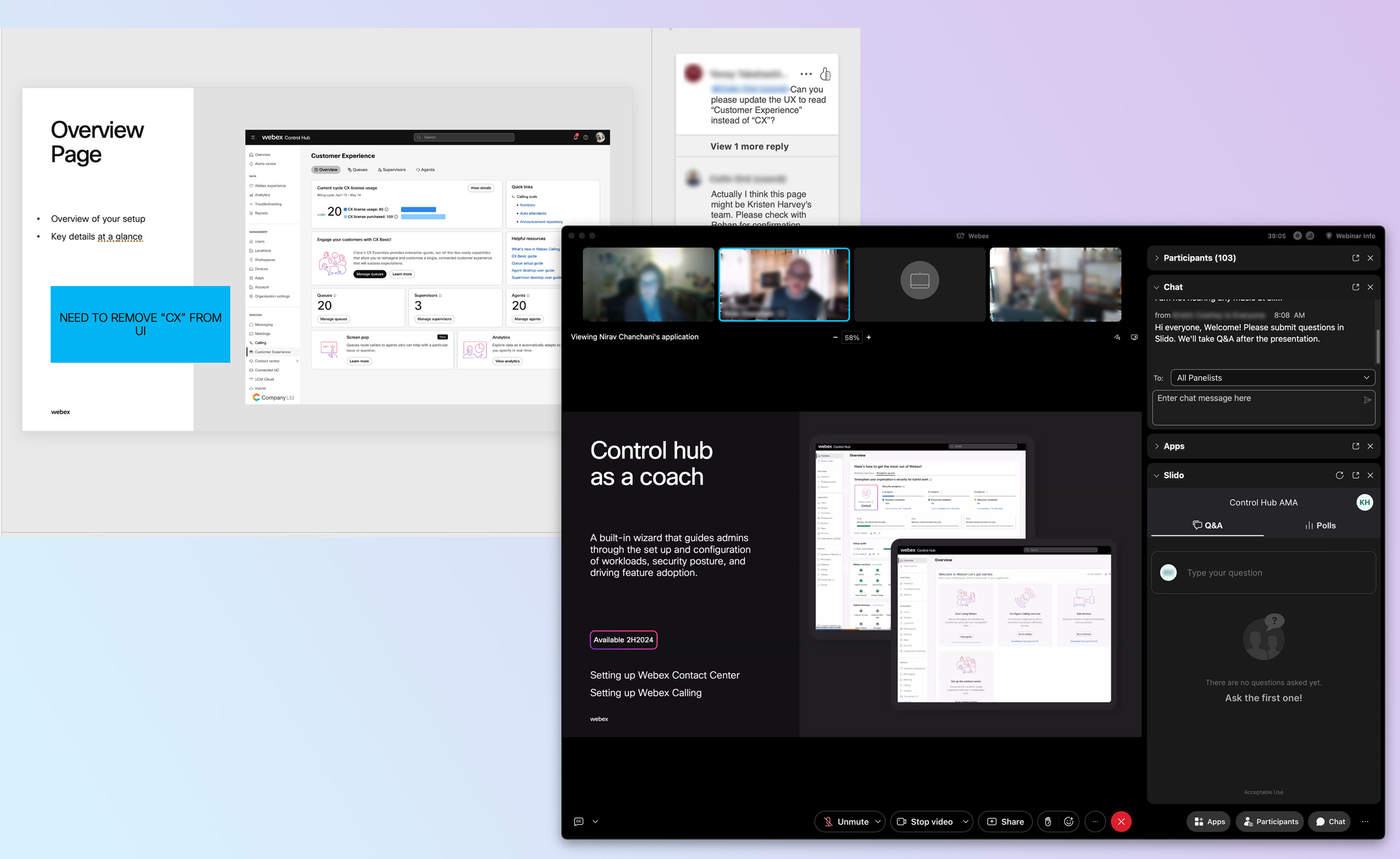
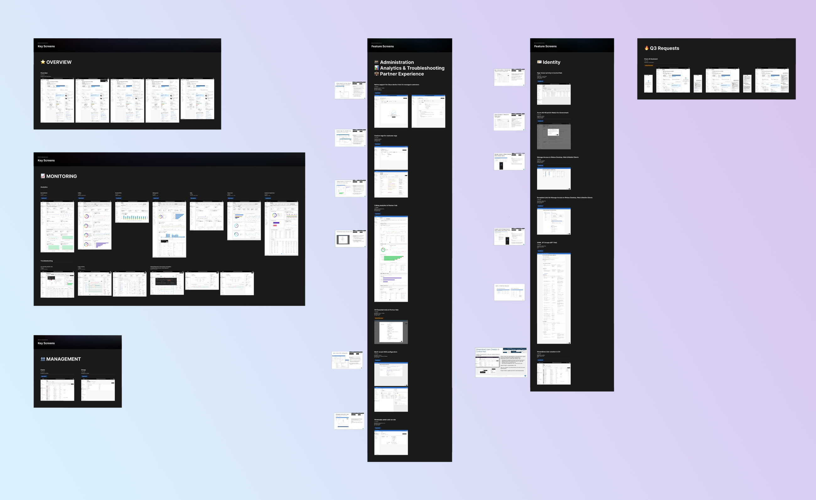
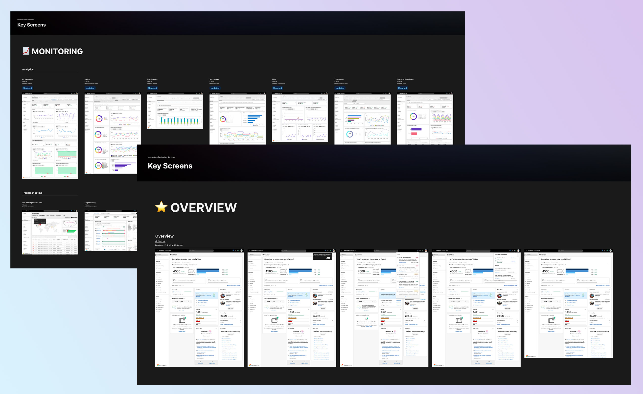
TThe product managers for Collaboration products use various product screenshots for their presentations. In the past, there have been too many cases where the PMs grabbed outdated or wrong feature screen captures. Our mission was to build a library of products and feature key screens where the designers and PMs for reference and presentation.

Created at:

Momentum Design Systems Team

Role

QA Designer, Project Management
Importance

To represent the latest and greatest design and visual work in our presentations to customers to raise the perceived quality and consistency of Control Hub and Partner Hub.

Key Screen selection

Based on past requests for events, the screens on the Key Screen library are the most used and requested. This selection can (and should) review the list as new features roll out.

Purpose

Accurate and current key screens are critical for PMs, Marketing the field. They give credibility to our hard work by showing accurate high-quality glimpse of our product.

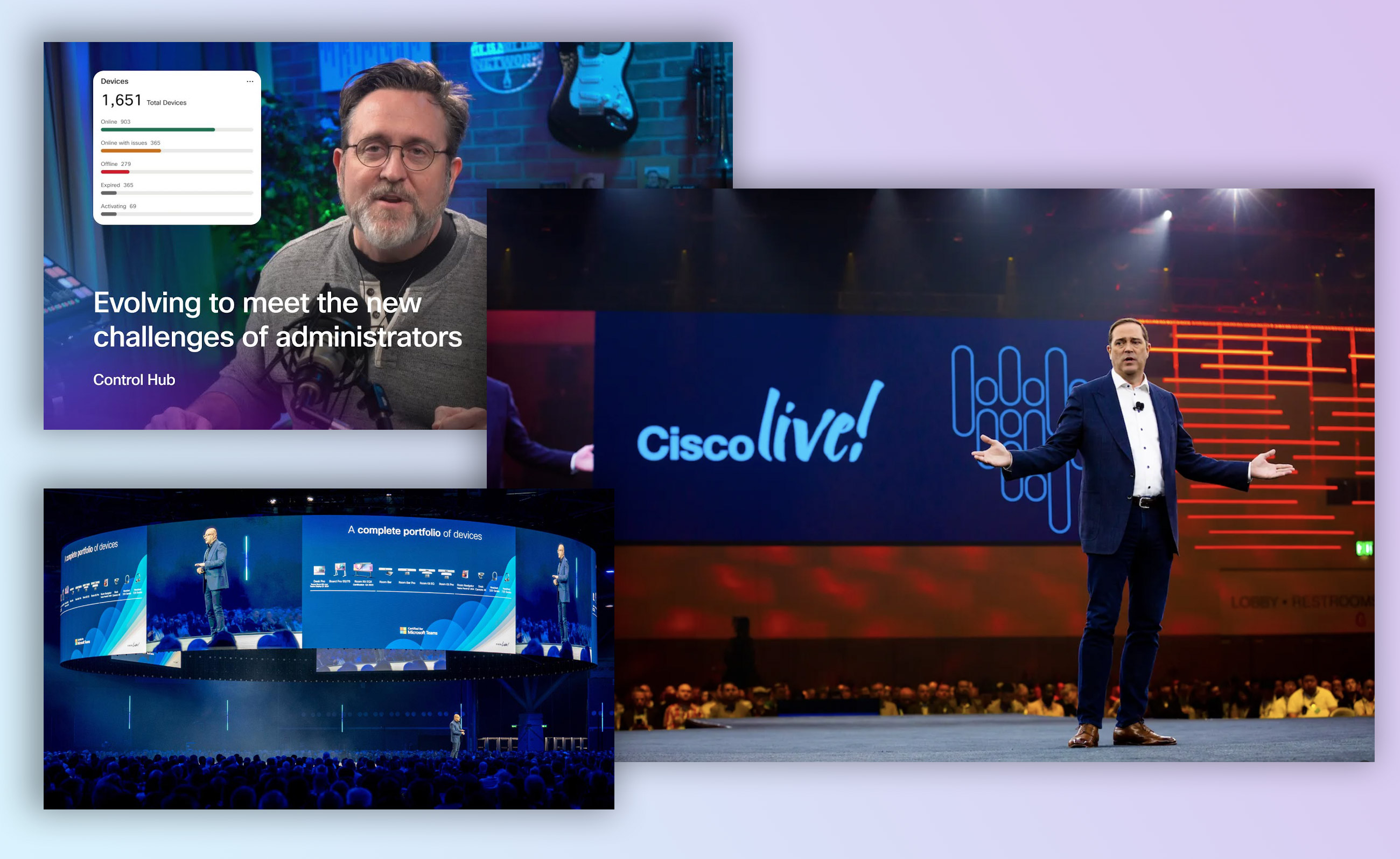
These screens are seen in Product Vault sessions, TOI (Transfer of Information) as TME and TAC are briefed on new features to support customers, in What’s New and Help articles online, as well as a wide range of event keynotes and sessions.

Key Screen selection

Based on past requests for events, the screens on the Key Screen library are the most used and requested. This selection can (and should) review the list as new features roll out.

Categories

Event Keynotes:

From C level executives and VP level on stage at Cisco Live, Webex One, and Directors and managers in a product lead session.

Product Vault:

A monthly PM run review of the features GAing and those coming up on the roadmap for Internal Stakeholders

What's New & Help Articles

A monthly PM run review of the features GAing and those coming up on the roadmap for Internal Stakeholders

Transfer of Information Documents:

When new features are launched, our TMEs and TAC teams are be trained to support them for customers. Screens are often used to illustrate the feature.

Maintenance

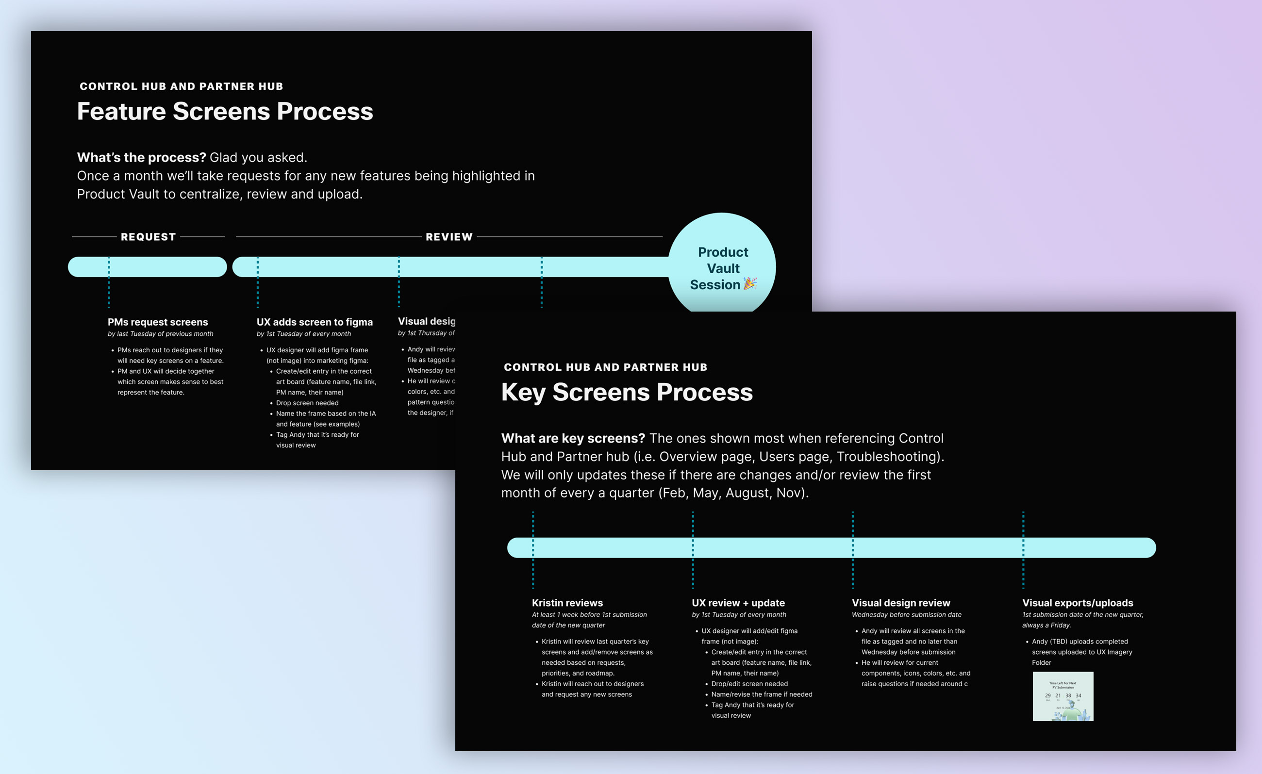
Once a month we’ll take requests for any new features being highlighted in Product Vault to centralize, review and upload. Then screens are refreshed on a quarterly and monthly basis around our large customer events (Cisco Live, WebexOne, etc) and monthly product vault sessions. Kristin and PMs will kick off a refresh > Feature designers will receive requests from Kristin or their manager/PMs to add key screens > Andy from momentum design ensure the screens have the latest visual treatment/library updates.

Request

We ask PMs to request any screens by last Tuesday of previous month. PMs reach out to designers if they will need key screens on a feature, then PM and UX will decide together which screen makes sense to best represent the feature.

Review

Quality assurance process will specifically be checking to make sure the key screens are using all the latest components from the Admin Component Library, color tokens from Theme Color library, text from Cisco Typography type system, and consistent spacing and padding from Admin Component library shell.

UX adds screen to Figma by 1st Tuesday of every month:
  • Product UX designer will add figma frame (not image) into marketing key screen library Figma. When adding these screens, each designer needs to fill in the Feature name, File link, PM name and their name, so other designers and PMs know who is working on what file.
  • When the frame is placed in the key screen library, name the frame based on the Information Architecture and features. For example, "ControlHub_Users_LocationSettings".
  • Once these screens are in place, the designer who placed the screen comment-tag me so I can review the visual and UX to make sure it is indeed latest and greatest.
Visual design review by 1st Thursday of every month:
  • I will review all screens in the file as tagged and no later than Wednesday before submission.
  • I will review components, icons, colors, illustrations, spacing and UX. If any, I will raise general pattern questions to discuss with the designer.
Visual exports/uploads 2nd Tuesday of every month:
  • Designers will have until the 2nd Tuesday to make updates and edits from my comments.
  • Once final review has been done, I will export screens from figma as 2x PNG files by the EOD.
  • Screens will be uploaded into UX Imagery > Current Quarter > Feature Screens folder

Conclusion

  • It was surprise to experience first hand how disconnected the PMs and designers were. The PMs would normally grab design screen shots from other powerpoint files instead of figma.
  • The importance of this project was highlighted as I leaned that the key screens get used on the biggest stages for Cisco events, external meetings and sales presentations. Using outdated designs for external use was not only discrediting the designer's work, but could hurt the company image as well.
  • Biggest pain point from this project was to track down the designers and get them to update the flaws on time. I ended up making lot of the updates myself to meet the deadline, and downside of that is that the designer working on the file will not be aware of the change, and repeat the mistakes
  • At the end of the day, hardest part was communication, but setting a system in place helped as the project progressed, and getting the managers to get on board, and have their designers add and update pro actively.

Contact Me

I’m looking to join a cross-functional team that prioritizes improving user experience through accessible and innovative design. Got a project in mind? I’d love to connect!