WORKS

Cisco Partner Logo Builder

Cisco partners rely on official logos and credentials to represent their relationship with Cisco across sales, marketing, and certification materials. These partners are not just users — they are paid clients, often operating at scale.

However, the existing Partner Logo Builder experience had not kept up with the complexity of the partner ecosystem or modern UX expectations. What should have been a straightforward task felt overwhelming, outdated, and hard to trust.

Created at:

Cisco .com Support Team

Role

Product Designer (Sole design lead, cross-functional collaboration)

Importance

Cisco partners depend on official logos and certificates to represent their tier and earned credentials in customer pitches, sales collateral, and co-branding materials. The existing tool was visually outdated, confusing to use, and caused unnecessary friction for partners — who are paid clients and sophisticated users that rely on this system to represent their brand accurately.

Improving this experience directly impacts partner satisfaction, compliance with Cisco branding, and partner go-to-market confidence.

Context & Problem

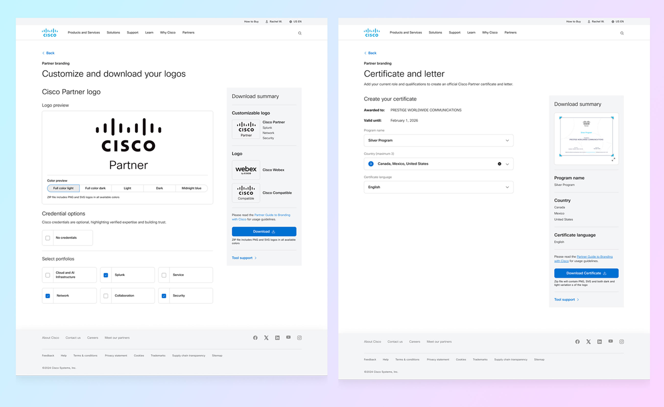
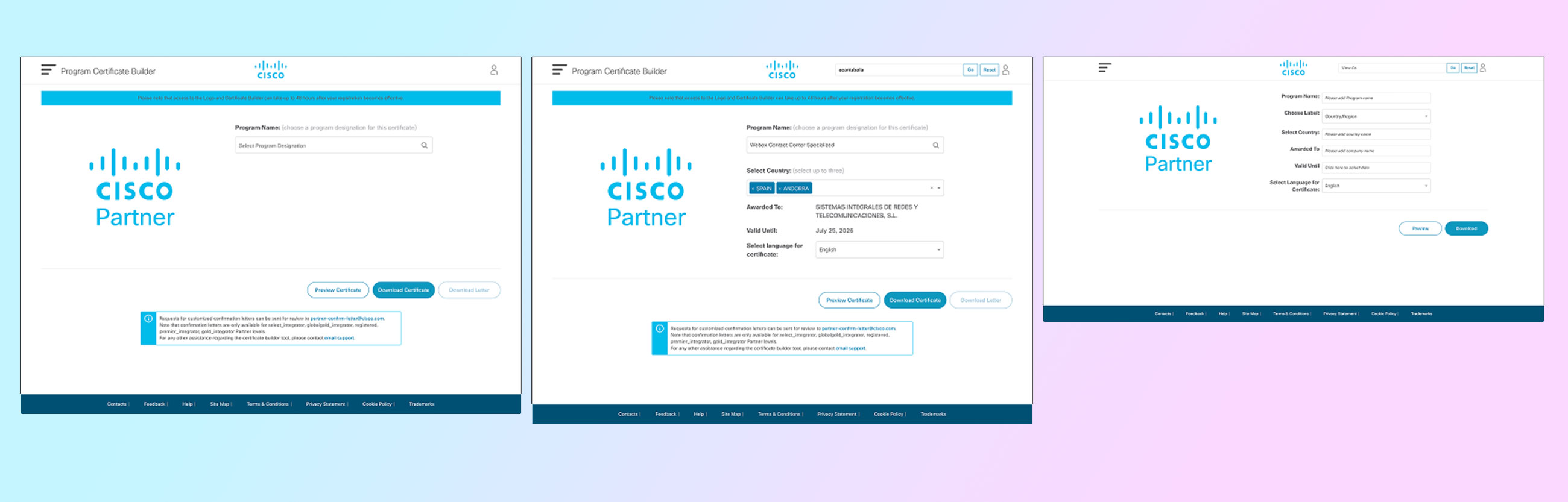
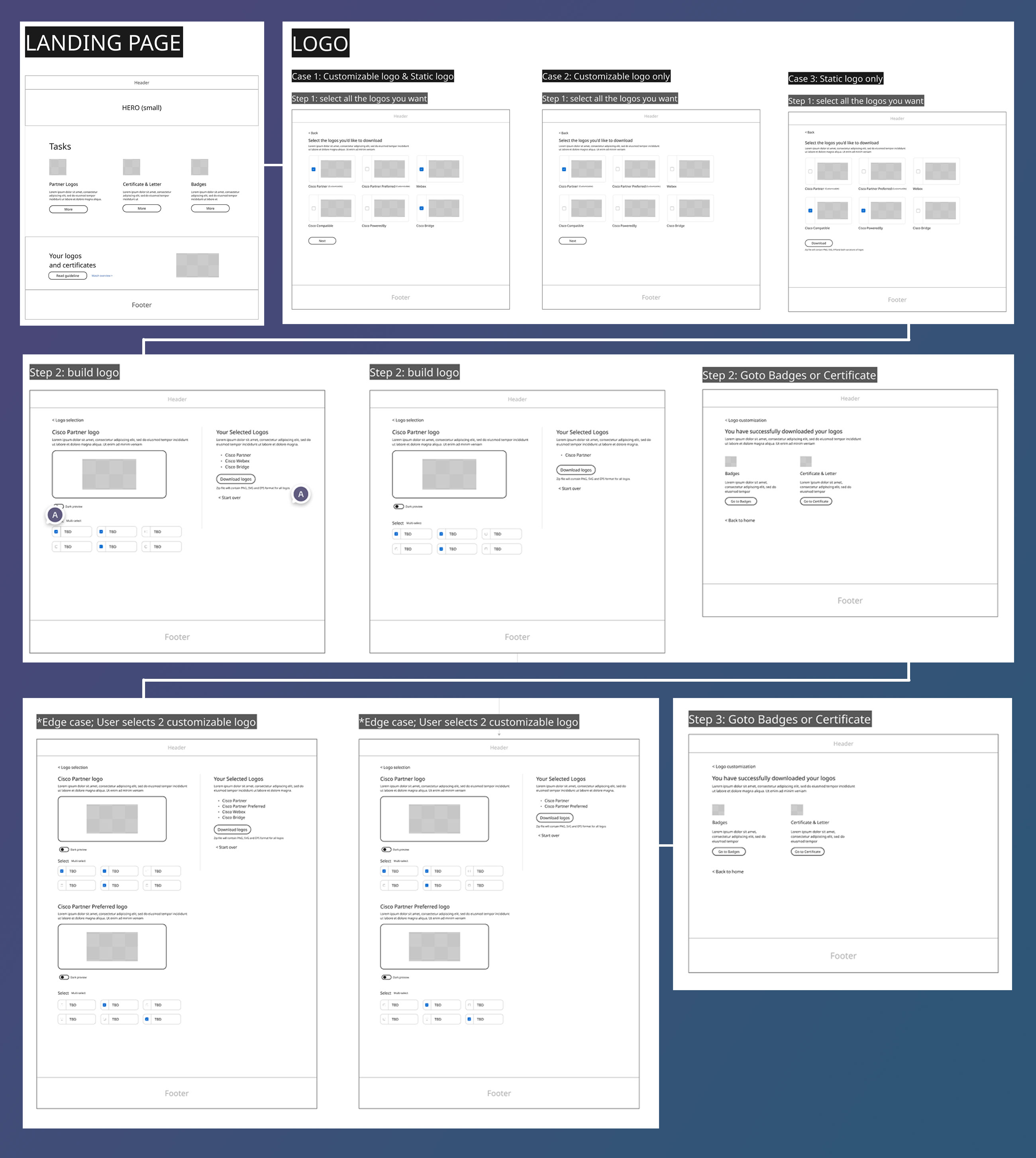
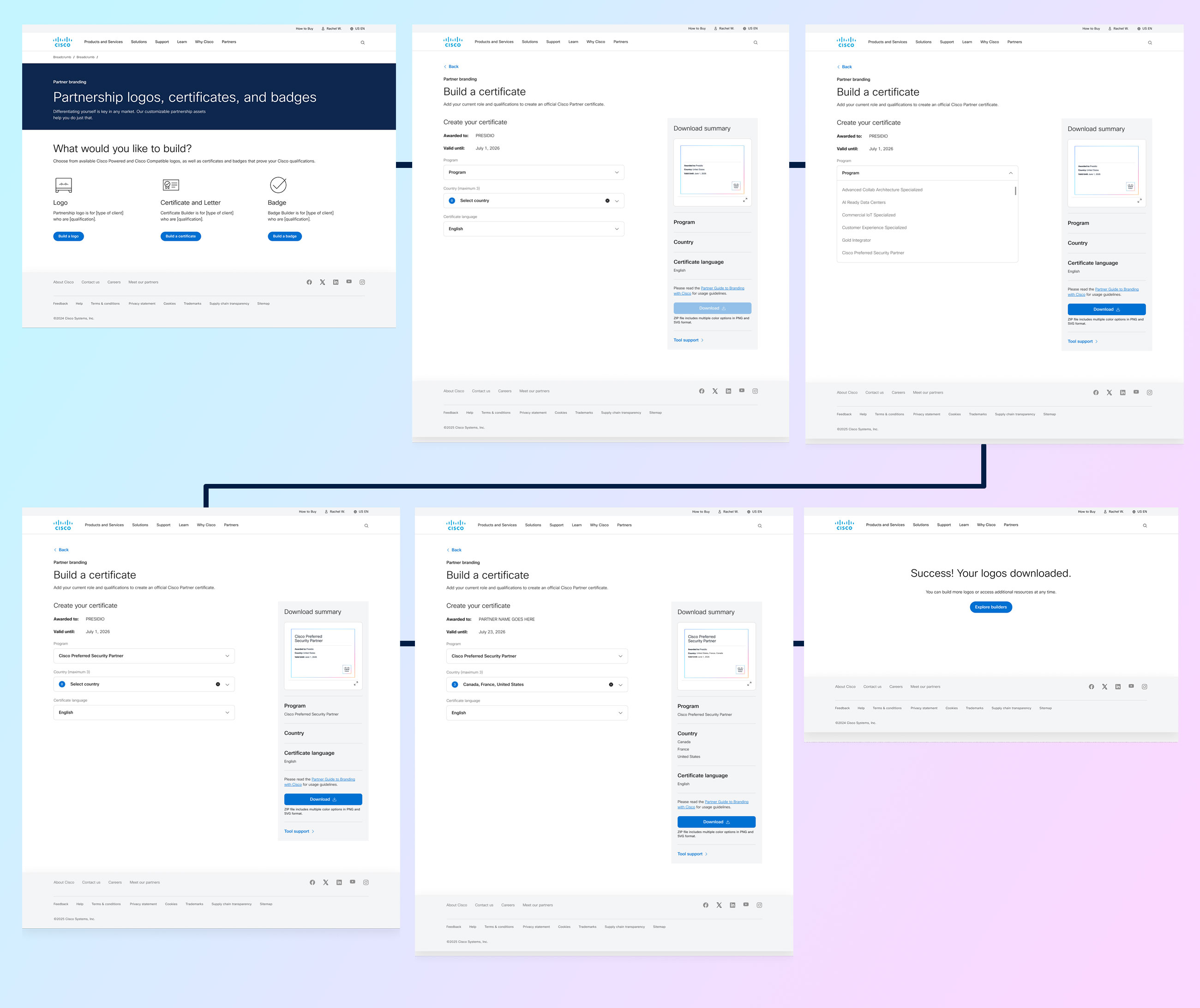
The legacy Partner Logo Builder presented everything at once — logo colors, credential selection (up to four), live preview, and downloads — all on a single, crowded page. Partners were forced to:

  • Select a color before understanding what type of logo they were creating
  • Scroll and interpret a long list of credentials without guidance
  • Make multiple decisions in an unclear sequence
  • Download multiple assets manually across colors and formats

This all-in-one UI assumed that users understood the context, how many credentials they should use, and what the right output was — which was not true in practice.

As a result, partners struggled with:

  • Flow confusion
  • Decision fatigue
  • Poor confidence in their final assets

Purpose

The purpose of the redesign was to:

  • Guide users through partner asset creation based on intent rather than configuration overload
  • Clarify terminology and logic (e.g., renaming “credentials” to Portfolios)
  • Reduce unnecessary decisions through better defaults and progressive flow
  • Modernize the experience to match Cisco’s brand standards
  • Improve real-time feedback and confidence through a persistent summary panel

This was a strategic UX redesign, not just a visual refresh.

Discovery & Strategy

We began by mapping the existing user journey, identifying pain points around:

  • Decision order (e.g., color before context)
  • Cognitive load from long credential lists
  • Misalignment between partner behavior and system assumptions
  • Download confusion and fragmented outputs

We collaborated with internal stakeholders and partner-facing teams to understand how partners actually used assets and what outcomes they cared most about.

Bi-weekly stakeholder check-ins ensured alignment across product, brand, partner program teams, and internal clients throughout design iterations.

Design Process

User Flows & Mapping

We reframed the partner’s journey into discrete, intentional steps rather than a single sprawling page.

Wireframes & Prototypes

Iterative wireframes helped us refine the logic before moving into visual design.

Visual Design & System Integration

The UI was modernized to align with Cisco brand standards, with thoughtful type, spacing, and spacing logic that reduced overwhelm and improved readability.

Feedback Loops

Bi-weekly client reviews shaped design decisions and ensured solutions aligned with partner expectations.

*Additional details and a live prototype walkthrough are available upon request during the interview process.

Solution Overview

The new flow was designed from a partner’s intent, not a technical list of options:

  1. Intent-First Landing
  2. Users start by choosing what they want to create (logos, badges, etc.) from a unified landing page. A Download Summary panel tracks selections in real time, giving visibility and confidence from the beginning.

  3. Conditional Customization
  4. If users choose a Customizable Cisco Partner logo, they move into a focused customization screen where:

    • Logo preview is front and center
    • Credential language is updated to Portfolios
    • Eligible options are shown based on partner status
    • Partners can choose no portfolios or add portfolios — with the summary updating instantly

    This reduces assumption and supports partners who don’t need credentials on a logo.

  5. Smart Output
  6. Rather than forcing partner to pick colors manually and select formats individually, he redesigned product produces one clean download package (ZIP) that includes:

    • All approved color variations
    • Multiple file types
    • Ready-to-use assets

    This mirrors real partner usage and reduces friction.

  7. Completion & Next Actions
  8. After download, users land on a success screen with a clear CTA back to the main landing page. The landing screen now highlights three primary choices — including the new Badge option — which expands the system while keeping navigation simple.

Logo Process

The Logo flow was designed to support both simple and advanced partner use cases without forcing unnecessary decisions.

Partners begin by selecting the logo they need from a unified entry point, rather than navigating separate tools for wordmarks or partner logos. From the first interaction, a persistent Download Summary panel tracks selections and next steps, helping users stay oriented throughout the process.

If a partner selects a Customizable Cisco Partner Logo, they are guided into a focused customization step where:

  • The logo preview is prioritized at the top for immediate visual feedback
  • Credential terminology is updated to Portfolios for clarity and alignment
  • Partners can choose to add portfolios or download the logo without them

As selections are made, the Download Summary updates in real time, reinforcing confidence and reducing decision fatigue. Instead of requiring multiple manual downloads, the final output is a single ZIP file containing all approved color and file format variations.

Certificate Process

The Certificate flow was designed to feel official, trustworthy, and highly contextual, reflecting the importance of certification for Cisco partners.

Partners begin by seeing their company name prefilled in the “Awarded to” field, along with a visible validation date, reinforcing legitimacy from the first interaction.

From there, the flow guides partners through a structured, rules-based configuration:

  • Program Selection:
    The program dropdown only surfaces programs the partner has actually certified for, removing guesswork and preventing invalid selections.
  • Country Selection:
    Partners can select up to three countries where the certification applies. If no country is selected, the system automatically defaults to an appropriate regional designation (e.g., EU, Asia Pacific), ensuring the certificate is always valid and complete.t
  • Language Selection:
    Certificates default to English, with the option to generate certificates in other supported languages, allowing partners to localize assets for regional use.

As partners make selections, the Download Summary panel updates in real time, showing a live preview of the certificate and confirming all choices before download. Once the configuration is complete, partners can confidently download their certificate knowing it reflects accurate program, region, and language information.

Badge Process

The Badge experience was designed to help partners showcase the breadth of their expertise in a compact, digital-friendly format.

Badges allow partners to add their earned credentials to an official Cisco Partner Badge, making it easy to communicate credibility across websites, profiles, and digital touchpoints.

Partners configure badges through three clearly defined sections:

  • Portfolios:
    Partners can select up to four portfolios, ensuring the badge remains readable while still representing core areas of expertise.
  • Specializations:
    Partners can choose up to six specializations. While these options share the same underlying credential set as competencies, separating them into their own section helps partners better understand how their expertise is categorized.
  • Competencies:
    Competencies use the same eligible options as specializations but are intentionally presented as a distinct section to align with Cisco’s partner program structure and mental model.

This separation improves clarity without increasing complexity.

As partners make selections across all three sections, the Download Summary panel updates in real time, reflecting their choices and showing a live preview of the badge. This immediate feedback helps partners validate hierarchy, balance, and readability before downloading.

Once satisfied, partners can confidently download the badge, knowing it accurately represents their credentials and aligns with Cisco branding standards.

Prototype

Prototype walkthrough demonstrating all three Partner Logo Builder flows — Logo, Certificate, and Badge — with guided steps and real-time download summary updates.

Handoff & Collaboration

The engineering handoff was smooth and efficient:

  • We walked engineers through the flow using Figma Developer Mode
  • Detailed component specs, behaviors, and edge cases were documented
  • Early engineering collaboration ensured feasibility and alignment

This prevented rework and allowed developers to build with confidence.

Outcome & Impact

The new Partner Logo Builder delivers:

  • A clearer, guided partner experience
  • Reduced cognitive load and better contextual decisions
  • Higher confidence in produced assets
  • Scalable logic that supports future expansions
  • Very positive stakeholder feedback — internal clients were highly satisfied with UX and clarity

The project strengthened alignment between design, engineering, and partner teams, ensuring our solution was robust and production-ready.

Conclusion

By focusing on intent, clarity, and partner behavior rather than presenting all options at once, we transformed a difficult tool into a predictable, confident experience. The result feels modern, intentional, and aligned with how partners actually work — putting them first instead of overwhelming them.


Contact Me

I’m looking to join a cross-functional team that prioritizes improving user experience through accessible and innovative design. Got a project in mind? I’d love to connect!